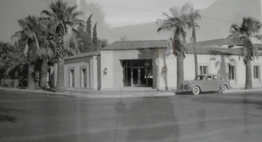
 The First Library Building In Palm Springs opened in 1941 The First Library Building In Palm Springs opened in 1941 By Michael A. Thomas, FASID, CAPS, Interior Designer The Welwood Murray Memorial Library in downtown Palm Springs was distinctive from the first day it opened that winter of 1941. And it must have been a proud moment on that Wednesday, February 19th for the residents of the recently incorporated City of Palm Springs. While there were many other buildings, retail stores and hotels already along Palm Canyon at the time, the Wimmel, as it was soon called by many of the town’s residents, was positioned at the very heart of the growing community. After the library being in several locations, operated by a group of very dedicated locals, this new building would now be the city’s first permanent location. Designed by architect John Porter Clark, the costs to build were entirely paid with private donations ranging from just a few single dollars to one single gift of $10,000 from Palm Springs benefactor Thomas O’Donnell. The library board commissioned the architect to “design the building and directed him to take best advantage of the prime corner lot…” according to the book, At Sunrise – the History of The Palm Springs Public Library. Clark did just that and positioned the main entry to the library at a forty-five degree angle to Palm Springs’ zero-zero corner. The agave-green “proscenium” surrounding dark stained double wood doors welcomed residents and tourists alike. 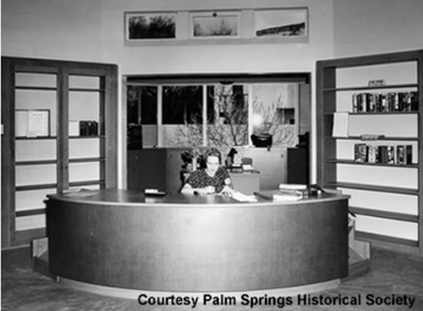 The reception desk was positioned at the axis of the Grand Hall The reception desk was positioned at the axis of the Grand Hall The clean lines of the building, off-white painted concrete walls, steel casement windows and terra cotta roof material helped Clark introduce a “desert modern” vernacular to Palm Springs. The use of the same materials can be seen in a Spanish revival residence he was designing for the Hamrick family on West Vista Chino at nearly the same time. Before Tahquitz was widened from a smaller two lane road, a six-foot wide band of green grass ran along the north sidewalk, perforated by four well established palm trees, each with green bushy tops and dark tree trunks. This band acted as a frame for the building. When the Wimmel opened on that February day, the winter sun kept the daylight short. The cool morning light shown down on the copper used for the rain gutters around the perimeter, down spouts and coach-style wall sconces at the entry, bright shiny like a new penny at the time of installation, It must have given off an amber sparkle to the library in the sunlight. By mid-afternoon, long shadows stretched out along Palm Canyon Drive as the sun dropped behind the mountains. By about 5:30, the library staff would have switched on the copper framed square and rectilinear recessed can lights above the entries, and together with the perforated metal design of the coach sconces, there must have been a distinctive warm glow that very first night. Despite the donations collected to build the Wimmel, there evidently wasn’t much money allocated for the interior. Letters and memos seem to suggest that furnishings and fixtures may not have been on anyone’s immediate agenda if not totally left out of Clark’s assignments.  Looking east across the Grand Hall filled with bookcases and art. Looking east across the Grand Hall filled with bookcases and art. In January of 1941, at just six weeks before the library was to open, a letter to then-Mayor Philip Boyd from James Geggie, the chairman of the library board, asked that Clark be given instructions to prepare the details necessary and “with the hope that he may go forward without any further delay.” Certain assumptions can be made about how the interior might have appeared on that opening day from records, letters, and photos. While bare concrete floors may be a popular trend today, it is unlikely that the library actually opened with such a finish. However, there appears to be a red-brown color to the exposed floor that could indicate that at least for a time, the floors were stained. What is known is that linoleum covered at least parts of the interior, perhaps in the bathroom and that wall-to-wall carpeting was installed sometime later. A counter-height semi-circular reception desk positioned to greet visitors once inside the entry featured a clear-stained oak wood top and matching toe kick. The curved façade appears to have been covered with “faux” leather, a material that might have been "Fabrictoid" and perhaps in a reddish brown color, though it is difficult to determine from black and white images. Shelving to hold the very small number of books the library had on hand at the time was made by a Riverside company from agave green stained pine and clear-stained oak. Construction of the box-style cabinets, bookcases and shelves were quite elementary, void of commonly used woodworking details such as mitered, rabbet or other joinery, and as such would have been modestly priced to fabricate. Wood framed oak chairs with vertical splat backs and stepped-style bookracks were standard-issue, common and without detailing, identical to those found in libraries all over the country. The interior must have been quite dimly illuminated. Small round ceiling-mounted shiny metal pendants are seen in photographs. Other documentation reveals that before the library was opened, at least some of the overhead lighting, along with air conditioning and heating, was eliminated “from the plans so that there would be funds to pay for a children’s wing.”  Gazing to the west, the curve of the reception desk is clearly seen. Gazing to the west, the curve of the reception desk is clearly seen. The finish on the walls in a light color continues, to this day, to show the poured-in-place construction of the concrete walls. Was this a specific choice made by Clark or one made because of limited funds? In fact, it might have been a little of both; a modernist approach to finishing wall surfaces that was also economical. In moving forward with the rehabilitation of the interior, the character-defining assets are being respected. The concrete walls, the vault in the ceiling that extends in two directions from the angled entry, dumb waiter, steel casement windows and existing entry doors will remain. However, it is apparent that the interior wasn’t “designed” to be particularly special. After all, one of the tenets of design is ‘Form Follows Function.” And the Wimmel was designed to function. Designed to be utilitarian, Clark created a building to be practical and laid out in a sensible and efficient manner. But it doesn’t have a high level of aesthetics nor visual appeal like the many residences or the St Paul’s Church that Clark (and his partner Albert Frey) designed about the same time. The interior was there to do a job and it did that successfully for decades. In some ways, the new design for the interior will be similar to the original design. In other ways it will be different. The new interiors will have the same efficient functionality as before but will now have to accommodate the needs of three stakeholder groups. The Palm Springs Historical Society and the Board Of Tourism will join the library staff in the daily operations. 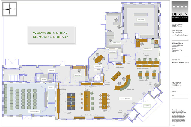 A strong design statement however will allow the Wimmel to be a memorable experience and inviting to both locals and tourists. A higher level of esthetics and quality will continue the branding of Palm Springs as a place of well designed environments. Clean lines and simple forms will continue to echo Clark’s theme. The semi-circular form of the original reception desk will be incorporated but in an updated version, one that will hold computers, phones and point-of-sale equipment. The new reception desk along with other areas in the interior, must also meet the standards for accessibility as specified by the American For Disabilities Act(ADA). Technology will be installed in tables, cabinets and near seating areas that will provide opportunities for people to plug in their laptops and charge their smart phones. And free Wi-Fi will be available to all. Lighting will be more appropriate to the use of the space yet kept at lower levels than one would find at a retail store in keeping with the historic nature. LED lights in a warm color tone will be both energy efficient and provide the visitors with task lighting from candlestick lamps.
One “green design” goal is the consideration and choice of vendors to supply goods, such as the seating for the community room, determined by being no further than 500 miles from the Welwood location and thus limiting the carbon footprint effects of transportation.
When the rehabilitation is complete at the end of 2014, the Wimmel will be then positioned for the future. It will be a place to hang out and a source for information and education. Researchers interested in all things historic about Palm Springs will cross the threshold to examine the archives of the Palm Springs Historical Society. And tourists will be given another opportunity to discover what makes Palm Springs so special. This is just the beginning for a new life and purpose for this very special building. It may not have the sparkle from the copper fixtures but in its own way it will be a shining bright spot in an evolving downtown.
9 Comments
 Technology has impacted how we work, increasing our productivity, efficiency and ability to manage multiple objectives. When it comes to our homes, technology makes it easy to control our thermostat, monitor the home alarm system, and use our iPhone as a TV remote control. Amazing, eh? But with all the tech-stuff comes the challenge of keeping the the cords and the clutter they create under some measure of control. You know... a place for everything and everything in its place. So here are five fresh ideas to help you do just that. 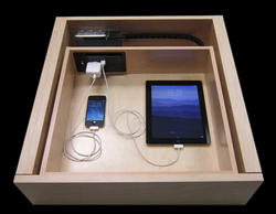 • First Idea: Create a charging station within a drawer. It takes a bit of doing but when you are remodeling a kitchen or adding a home office, this one is an easy one. And while this works if you only have one iPhone and one iPad, there probably isn't enough electrical outlets to accommodate a family of phones and pads. So think about making that outlet a plug strip. That way you are less likely to run out of outlets. 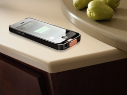 • Next Idea: This one is amazing. Imagine that your entire countertop in the kitchen or the bath has the ability to charge your smartphone. Well, imagine no more because there are vendors making solid surface counter materials that can keep our cell phones charged up with out a cord. Amazing, eh? Imagine how good this would be if the top to your cocktail or end table had the same feature. 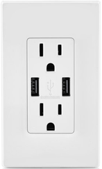 • Third Idea: We first saw the prototype of this about three years ago and knew that it would be just a matter of time before a standard outlet and USB charging port would be combined and in the marketplace. No more fumbling around for a charging brick.. just plug that pad or phone using a standard USB cable. Cost will vary but you can generally pick one of these up for about twenty bucks. Installation is easy. Just remember to kill the power to that old outlet before replacing it with this new one other wise it might be you that gets the charge. And certainly, a licensed electrician would be a wise investment, especially if you have several installed all thru the house.  • Fourth Idea: This is pretty low tech idea when it comes to other solutions but it works. Take a series of those large spring-loaded paper-binder clips and mount them at the back or to the side of a desk or countertop. Weave all those cords thru the "arms" and keep the cords dangling out of sight until you need them. 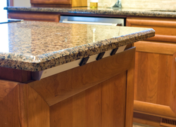 • Fifth Idea:
Sometimes part of the clutter issues are really about not having sufficient places to plug our stuff into. From Task Lighting comes this angled pug strip that can be easy customized for what ever you want. Say that in a two foot length, you might want two 120v outlets and three USB outlets. No problem. And how about where to place it? The track is angled and designed to fit under a countertop as in this picture or beneath the bottom of a wall mounted cabinet. 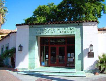 The Welwood is located in the heart of downtown Palm Springs. The Welwood is located in the heart of downtown Palm Springs. As you pass the southeast corner of Tachquitz and Palm Canyon Drive in downtown Palm Springs, it is hard to miss the angled entry to the original library, a structure that opened in 1941. And while it has not been a library for many years, sitting stripped of books and bookcases and vacant awaiting a new purpose, it is a classic bit of architecture that represents the hopes and future of a desert city in its infancy. Now, after many starts and stops, the Welwood Murray Memorial Library is getting ready for the future. The city has signed contracts to renovate the building into a multipurpose facility housing a micro-branch of the library, the archives of the Palm Springs Historical Society and a branch of the PS Bureau of Tourism. And Michael A. Thomas, FASID and the Design Collective Group is pleased to have an important roll in the Welwood project providing the interior design and design specifications for this historic location. 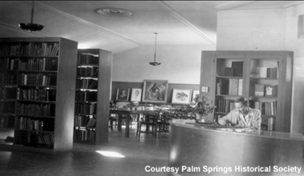 Looking east wall past the reception desk, there was a display area for art. Looking east wall past the reception desk, there was a display area for art. As the interior design firm charge with the interior design, one of the main objectives is to be sympathetic to the architect John Porter Clark's design of the building. There are just 4 interior photos and little reference material available to use as guide posts for the design development so some research and digging around was necessary. What was learned during the discovery period about the original interior is that it was likely a quite simple, functional and perhaps even a bit austere space, not unlike other government and institutional buildings of the same era. If you were one of the Palm Springs residents to step inside when the Welwood opened in 41, you would have seen bare concrete floors, exposed poured-in-place walls, vaulted plaster ceilings and hand built wood bookcases. And when the doors open late this year, the design renovations will feature very similar details. In the design for the library, the vision is to provide an impression to the visitors and guests that the interior has been well preserved over time. So refinishing the original concrete floors, keeping a semi-raw texture on the concrete walls, replacing the moldings that outline the vault in the ceiling and installing book and display cases in finishes that appear aged were solutions that celebrate that era. 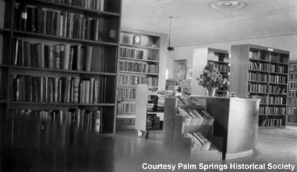 Rows of open bookcases lined the interior when the library opened in 1941 Rows of open bookcases lined the interior when the library opened in 1941 But it is just as important to look forward and give new life and functionality to this building. After all we live in an era when technology plays an ever increasing role.
So the library will provide free internet connectivity to those who venture into the space. Standing tables ( think Apple retail spaces ) will have plug strips to power laptops. Specially designed table lamps (with lamp shades made from recycled newspaper ) will feature multiple USB ports to connect and charge a tablet, iPad or smartphone. It is indeed exciting to be a part of the redevelopment and repurposing of the Welwood. And with so much happening in downtown Palm Springs, this renovated facility will play an important role in providing information, education, knowledge and research to Palm Springs guests, tourists, researchers and locals. The "kickoff" celebration is May 6th at 9 am right on the steps of the Welwood and is open to everyone. “The City of Palm Springs is experiencing a tremendous renaissance and I encourage everyone in our community to stop by Tuesday and learn more about how the new remodeled Welwood Murray Memorial Library will transform our downtown,” said Mayor Steve Pougnet. “This is an exciting time to live and work in our city and the best is yet to come.” Please join the festivities and help celebrate a new chapter in the life of this building. And visit us again here for more design details as they emerge.  You probably didn't but homeowners spent $130 billion on remodeling last year -- the largest amount since 2007. And more and more people are starting to update their home as the economy begins to move forward. In fact, Harvard’s Joint Center for Housing Studies expects double-digit gains in this spending category through the remainder of this year.
And there is some good news about remodeling depending on what you do. Consider this: According to the annual Cost vs. Value report from Remodeling.com, when you sell your home, you’re likely to get back as much as 97% of the money you spent (back) on some improvements -- but only around 50% on others. To put that in perspective, it means if you spend $125,000 on a project, you could see as much as $120,250 – but also as little as $36,500, in your sale price. It's tricky business so take a look around your neighborhood, find out what projects are being done and what price people are getting once their homes are remodeled. Use this information as a guide. A recent project in the Racquet Club Estates in northern Palm Springs is a great case study. An investor purchased a classic mid-century for $365,000. It had been on the market for more than 90 days and was in pretty bad shape. But after a fairly extensive remodeling, the owner sold the property for $570,000 in just a few days after going on the market. Thinking about a remodel? Call us and we can help you with an assessment of the possibilities. And one more thing,.... remember that one key to success is, as they say,... location, location and location. 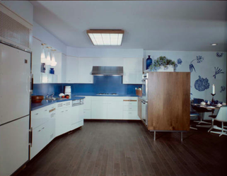 1963 Palm Springs Designer Showhouse Kitchen 1963 Palm Springs Designer Showhouse Kitchen Recently in Palm Springs, Modernism Week 2014 brought people from all over the globe to see what some say is the finest collection of mid-century modern homes in the world. This 9-year event celebrates the innovations in design and architecture and has continued to grow as people flock here to check out residential and commercial projects built between the early 1950s thru the 1970s. Events during the 12-day run include open-air bus tours, lectures and this year a designer showhouse organized by a member of the local design community. For me, it brought back memories of participating in just such charitable events. And I began to wonder about show houses in Palm Springs from years gone by. After during a little digging around, I discovered that one of the earliest designer showhouses held in Palm Springs was in the spring of 1963. It featured the work of many locals including well-known design pro, Arthur Elrod. What was interesting about this showhouse was the design of the kitchen and the St. Charles Cabinetry, a classic look from a classic name in cabinetry years ago. 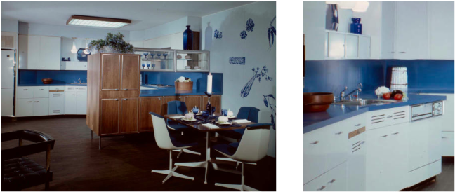 Innovations included cabinetry on legs and angled base cabinets for the sink and dishwasher. Innovations included cabinetry on legs and angled base cabinets for the sink and dishwasher. St. Charles Cabinetry is an American icon when it comes to vintage mid-century style and considered to be the “cream of the crop.” Established in 1935 in St. Charles, Illinois, the company was the leading manufacturer of all steel cabinets. Door and drawer faces were available in 23 powder-coated colors that went from black to white, from red to green and from turquoise to sunny yellow and even with two-tone options. With competition from Europe and increased manufacturing costs, the company quietly closed operations only to be revived by Viking Range Company around 2004. Sadly that venture only lasted about a year and it was the end of a well respected brand. 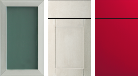 Aluminum, acrylic and colored options can give a kitchen that "Mod" look. Aluminum, acrylic and colored options can give a kitchen that "Mod" look. Today, those who still have an original St Charles kitchen in their home prize them for the functionality, cleanliness and modern aesthetic. Luckily there are new options to achieve a similar look with the use of acrylic finishes. These generally do a great job in replicating the look and feel of the once leader in kitchen cabinetry while keeping to a mid-century modern appeal.
One of our lines of cabinets , DuraSupreme not only feature brushed aluminum styles, acrylic drawer and door faces with an accented edge detail that mimic the look and clean lines of stainless steel as well but also foil-wrapped doors in several colors such as cinnamon pearl. So while you may not get to have an original “St. Charles,” there are options that do a great job in giving a mid-century "mod" appearance.  From The PR Press Newsline... Michael A. Thomas, FASID, CAPS and the Design Collective Group, an interior design firm based in Palm Springs, CA has received a BEST of 2014 Award from Houzz.com, an online resource for residential design. Michael and his full-service design firm won in the Client Satisfaction category. "Each year, our community of homeowners and home design enthusiasts recognizes the home building, remodeling and design professionals who deliver the best customer experience and the most inspiring and innovative designs," said Liza Hausman, vice present of the Houzz community. " Working with a client to achieve satisfaction is not always easy but we strive to build on-going relationships thru out our work with clients," said Thomas, a thirty year veteran designer with a large portfolio of work that stretches across North America. "It is an honor that Houzz would select our firm for such an award. Thank you." 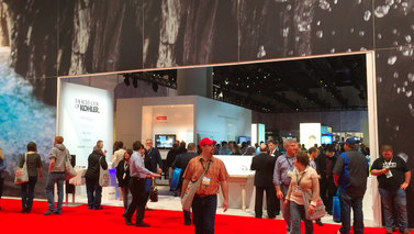 Making the trip to see all the various trade events is always a source of inspiration, a place to learn and to see the latest in innovation for house and home. And this year at the National Kitchen and Bath Industry Show ( KBIS ) in Las Vegas, there were many sources of inspiration. But one theme that was trending was accessible design. And it was evident in products by some of the biggest vendors like Toto and Kohler. Accessible design is designing interors that are great looking and provide spaces for people of all ages to live comfortably and securely no matter the age or abilities. Some may call it “aging in place”… but it really is about design that allows for the home to adapt to the changing needs of its occupants, giving them the ability to stay in place. 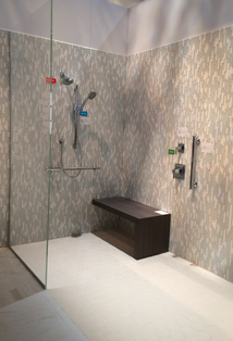 Beautiful shower by Toto. Beautiful shower by Toto. Toto, a leading maufacturer of plumbing fixtures outdid themselves with a full demonstration bath complete with a shower that was in a word awesome. The shower featured a European entry, a teak bench, heated floor, off-set controls and balance bars on two walls. The tile floors and walls had a slight texture to the finish to increase the safety aspect and with a no-stain grout for low maintenance. One of the important benefits of creating an accessible home is the resale value. When you consider that 76 million baby boomers are turning 65 at the rate of 10,000 every single day, having a home that can adapt over time gives the home an edge over residences on the market that have narrow halls and doors, multiple steps and poor lighting. And so many things are so easy to do and cost-effective light changing door knobs to door handles. 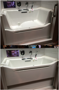 Kohler's sliding door access tub. Kohler's sliding door access tub. One of the other amazing products was the sliding door access tub by Kohler. This product was not only beautiful but the front face of the tub featured a door panel that slides up and down to make getting into the tub much easier. It has several options that can give the user a full spa-bubblier treatment. And a fast draining mechanism means that you don't have to wait more than two minutes for the water to drain.
If you have been thinking about ways to make your house a home for a lifetime, think about calling on our team to make that happen. Our expert designer, Michael Thomas is an expert in creating spaces that are functional and beautiful, easy to keep and safe to live in. Michael is also the co-author of an important book to the trade, Residential Design For Aging In Place, a book as a guide to "universal design" that is used by other designers, architects, and even in the college classroom. • Ready to start? Give us a call. 760-322-3784 Ext 2#. 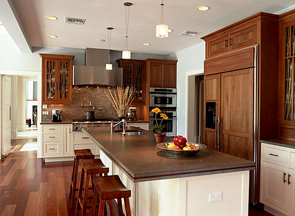 From Consumer Reports Magazine….
In this installment of 10 Questions for . . . , Senior Editor Daniel DiClerico with Consumer Reports speaks with Michael Thomas, FASID, CAPS, an interior designer and a coauthor of Residential Design for Aging In Place. Here, Thomas (shown below) talks about the past and future of the aging-in-place movement and offers tips for making your home more accessible in only a weekend. How do you define aging-in-place design? Aging in place is about creating homes that are safe and secure but, more important, it's about creating homes that will allow someone to remain as independent as they possibly can regardless of their abilities. What's the history behind the aging-in-place movement? It goes all the way back to Franklin Roosevelt, who most people today know had polio. But at the time very few people realized he had the crippling disease. Around 1938, Roosevelt desired a retreat he could escape to from the spotlight of the White House, a smaller home where he could, in his own words, become the independent person he longed to be. As the recorded architect on the building, which he would call Top Cottage, FDR was able to specify things like zero thresholds between the doorways and lower windows, which allowed him to gaze outdoors from his wheelchair. FDR might not have invented aging in place, but he was among the first to apply its principles. Seventy years later, why is aging in place just reaching the mainstream? From FDR, fast-forward to the end of World War II, when returning soldiers started having families. Baby boomers were the largest group of Americans born in a particular time, 76 million between 1946 and 1964. Younger boomers are now starting to turn 50, and older ones are into theirs sixties. This generation is living healthier lives and is beginning to contemplate where they're going to be for the rest of their years and decades. On top of that many of them are taking care of an aging parent themselves and don't necessarily want to think about alternatives such as assisted-living centers and nursing homes. So between the baby boomers and their elders, we have somewhere in the order of 100 million people in need of aging-in-place-environments. The tipping point is still four or five years out, but it's coming on fast. Is it a challenge getting clients to think about getting old? Yes, but the way we get them to accept it is by making aging in place as transparent as possible. It's often just a matter of perspective. For example, level thresholds (or a "curbless shower," like the one shown) facilitate access and they also just plain look good. So emphasizing the aesthetic value is very persuasive. Or take wider doorways: They enhance accessibility, also make a space look larger, and make it easier to get in and out with a suitcase, a baby carriage, or a wheelchair. What other key principles can be applied throughout a home? It starts with nonslip floors. Whether the surface is tile or stone, it needs a nonslip finish, because as we age, the potential to do real damage when we fall goes way up. In the kitchen, having multiple counter heights creates the ability to stand or sit. Raising the dishwasher up off the floor about 12 or 18 inches means someone with back problems or arthritis doesn't have to bend over to load the dishes. In the bathroom, lowering the counter and cabinets will allow someone to shave or apply make-up while in a seated position. Taller toilets are another key. Low-rise toilets, whose seats are 15 to 16 inches above the floor, became popular in the mid-90s, especially at the higher end. But using them puts more stress on the body, because your rear actually ends up lower than your knees. So-called comfort-height toilets, which are 17 to 19 inches off the ground, are much more preferable. If you're stuck with low-rise toilets, there are aftermarket products—basically little blocks that raise the toilet seat—but they compromise the transparency I spoke of earlier because they're so conspicuous. What are some quick projects that can be done in a weekend? It's a good long list—anything that creates the sense that we're still in control of our lives. * Change doorknobs to lever-style handles and swap out knobs for handles on kitchen and bathroom cabinets. * Add more light in a space, not only the general room illumination but also task lighting. * Remove nonessential doors, such as those in hallways. If you have doors that have to stay but you want to create a wider accessibility, you can buy offset hinges that will allow the door to move into room and create better accessibility. * Take up area rugs from the floors, like the welcome mat at the entryway. Unless they're perfectly flat, these rugs create a stumbling hazard. * Eliminate one or two pieces of furniture. If someone in the home is getting to point where they need a walker, having more open space will permit them to move more comfortably. * Choose chairs with arms that extend to the edge of the seat are easier to lift yourself up out of. * Use remote controls for more than TVs. They can also operate blinds and window coverings and turn on and off lights. How does aging in place affect the exterior of a home? There's a designer in Atlanta named Eleanor Smith who came up with the term "visitability." What it means is that anybody who comes to a home should have the easiest possible access. In addition to curb cuts in the walkways, that means no stairs at all to at least one entryway, and a door that's at least 36 inches. As for outdoor-living spaces, many of the same principles of interior design apply, including zero thresholds. How much does building an accessible home add to construction costs? When the National Association of Home Builders looked at building costs, its surveys found a 1 to 2 percent increase to create a very accessible home during new construction. Remodeling depends on the home and the client needs, but we've seen an average increase of 3 to 5 percent. That's because you need to do things like reinforce walls in the shower for grab bars and gut a space that has multiple elevations to make it one level. But so much of aging in place is elementary good design decisions that don't increase the cost. Are manufacturers embracing the movement? Manufacturers are beginning to realize the market but are not yet focusing on it. About five years ago, I had a conversation with an executive at a major plumbing manufacturer. He said to me, "It's just not worth it to create a line of products for old people." My reply was, "You have a large group of people who are holding the bulk of the wealth in this country. You can create very fashionable products that will appeal to these people and turn a nice profit for you." Five years later, plumbing-fixture companies like Kohler, Moen, and American Standard are beginning to realize that there is this unique marketplace where they can gain a foothold. Where can people go to learn more about aging in place? The American Society of Interior Designers is a great resource, as is the American Institute of Architects. The NAHB has a wonderful program called Certified Aging-In-Place Specialist (CAPS), and AARP is always a great resource where aging in place is concerned. On my Web site, I provide a list of "aging" resources, and through my blog I regularly publish new information to help everyone understand the benefits. And finally… I am the new president of a group of design and business professionals that believe that there is more to these ideas than just "aging in a home." The new organization is called the Design Alliance for Accessible, Sustainable Environments (DAASE) and thru our members, we suggest that these concepts are much more about enhancing the quality of life. We are excited about the message we are delivering thru this new membership-driven group. For more information about DAASE,… check out the website www.stayinplace.org  "Good clients are knowledgable.
Great clients are well informed." Those are the words I gave to a potential client, one who had never used the services of a professional interior designer and was in the midst of interviewing several other designers for their job. So after the first meeting, I felt the need to provide them with some advice about their upcoming project. • Be practical in all your choices including what and how you spend the dollars. Great design does not equate with spending large sums of dollars although that is often the perception of my profession. My advice to each new client when deciding what to spend : Put greater dollars toward just a few things that are most important to the design, that make the strong visual statement and that make the space function as needed. Far less dollars can then be spent for the rest as fill in pieces. Just don't skimp on something that will forever show you did. And at the end of the day, if you follow that advice, you'll discover that the entire space will look like a million but cost far less. • You need to have a definite plan before you start any work. Our first meeting was about seeing your new space. And shooting from the hip is great to build a bunch of fresh ideas about what you may want from the project but at the end of the day, the work you are contemplating will be an investment of time and effort. So my advice: plotting and planning on paper reduces the chance for mistakes in time, in expectations and in dollars spent. Steve Chase, the internationally known Palm Springs designer said about his work, "I am more deliberate than spontaneous in my design." I totally agree. Making a plan is worth every cent you spend. • Your designer needs to be your partner. Another bit of advice: You are making a huge change in locations and environments. That alone is a lot of stress. The design professional you engage should make the process thoughtful, provide the needed counsel on critical decisions and has your best interest on the table. With the right design partner, you'll discover a sense of comfort in making the seemingly numerous decisions that lie ahead and that alone reduces anxiety. The best ROI will not be in how much money you spend for furnishings but in the designer you hire. • And make this home fun. A final bit of advice: This home should reflect the energy of the occupants and its guests. So have some fun with making this house a home. Encourage your designer to implement something unexpected, something that keeps the space lighthearted and brings a smile to every face that encounters the design. And finally don't forget to make this journey fun. Interior design can be overly serious from time to time. After all when 80% of our time on this planet is spend indoors, design impacts everyone who lives and work in the interiors and there is a need to make it right. But take time to stop and reflect on the journey,... the opportunity to plan something special for you, your family and this house. |
 .................................................
• Michael A. Thomas, CAPS, FASID is a passionate interior designer that constantly examines the impact design has on the human experience. Michael is an award winning interior designer based in Palm Desert, CA. He is a Professional Member of the American Society of Interior Designers and a member of the ASID College of Fellows.
As a Certified Aging In Place Specialist, he creates smart looking spaces that are safe and secure and create homes for a lifetime. And with thirty plus years in the profession, he has honed his humor, elevated his passion for design and sharpened his wit to not take anything too seriously except his design work. 
Archives
February 2023
Categories
All
|
 RSS Feed