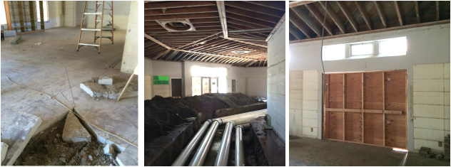
By Michael A. Thomas, FASID, CAPS The Welwood Murray Memorial Library The Welwood Murray Memorial Library What an exciting time to live, work or visit Palm Springs with so many great things happening about town. The decades old mall has given away to a new vision for downtown shopping and dining. Numerous hotels are in the works scattered about offering even more inviting accommodations. And now the historic Welwood Murray Memorial Library, the original Palm Springs library building originally designed by John Porter Clark in 1941 will be reopened very early next year. And no matter whether you are a full-timer like myself, a snowbird, snowflake or weekend tourist, you have to be excited about all this renaissance going on. It is both awesome and amazing. As the interior designer commissioned to work with the City of Palm Springs, the Library Board of Trustees and local renowned architect, William Kleindienst, I wanted to share a peak of the progress being made. The remodeling process began in earnest in late May of this year. There was actually very little left of the original interior, a few pistachio-green stained pine bookcases, a dumb-waiter and yellowed florescent light fixtures. Old plaster ceilings were removed to rid the space of asbestos. What did remain however after the library was shuttered years ago was ghost-print of the original library reception desk, clearly outlined in the stained concrete floor. SWEET ! Much of the demo is now complete. The old concrete slab was carefully cut open for the installation of a new high efficient air conditioning system along with new electrical, data and phone lines. In the upcoming weeks, concrete will be poured to cover the completed mechanical systems, fill the large cavity, provide a new fresh floor and new concrete finish not so unlike the original. 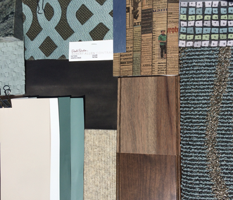 Furnishings + Fabrics Will Be Both Classic + Modern. Furnishings + Fabrics Will Be Both Classic + Modern. Next interior framing will segment open spaces into the much needed archives and offices of the Palm Springs Historical Society, a library staff office, staff meeting room, small kitchenette and a staff bath. In the east wing of the building, a community meeting room complete with audio-video equipment and seating for 40 will give groups a small place for meetings and events. The design of the interior is now complete after receiving required approvals from the stakeholders and governing councils. Whew! The final tweaks to the interior specifications are being made as we go to press with this post. • And the style of the interior?... A bit understated, quiet and clean, classic and modern at the same time and to not detract from the design of the building. The interior will be presented against a background of grey-beige and warm mocha colors, accented with a “pistachio” color, a color element discovered during our design development stage, an agave-hued tone used in the original scheme of the Welwood. 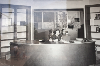 The Original Reception Desk With A "Faux Leather" Face The Original Reception Desk With A "Faux Leather" Face The furnishings, fixtures and equipment will provide flexibility to accommodate a variety of users and set the stage for a facility that is expected to be enjoyed daily by many including locals, tourists, historical researchers and for some, just a place to hang out, read the daily news or catch up on local gossip. When entering the threshold of the angled main entrance to the building, a curved reception desk will greet visitors. The design is taking its general shape, size, and materials gleaned from old photos yet updating the design to reflect the expanded use of the desk by staffers and to comply with ADA regulations. Plus we’ve designed the large desk to be positioned just exactly as it was when the library opened in 1941, carefully measuring the ghost-print on the floor just prior to the demo of the concrete slab. SWEET ! One of the more remarkable elements of the original desk was the use of a "faux-leather" or "fabrictoid" material on the front face, a product that had just come on the market in the 1930s. We know it today as vinyl or one of the trade-marked names : Naugahyde. 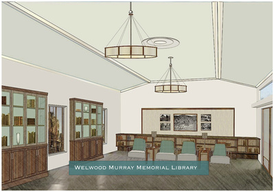 Interior Perspective Looking East In Welwood's Grand Hall Interior Perspective Looking East In Welwood's Grand Hall Glass enclosed display cases will provide the historical society and library staff members with areas to showcase artifacts, photos and books from days gone by. Standing tables will have charging ports for laptop computers and mobile phones. Both modern and "Moderne" style seating will offer visitors a variety of options, from comfortable lounges to reading chairs to bar stools. And we have specified durable, innovative, sustainable materials and products in the design such as recycled paper for countertops, low VOC paint finishes and special warm-white LED lighting in pendant, table top and wall sconce lighting that will comply with California's energy codes and generally help to reduce maintenance costs. . . . . . . . . . . . . . . . . . . . . . . . . . . . . . . . . . . . . . • So that is the current update on the progress and the plans for the rehabilitation of this historic building in the heart of downtown. Look for a new update in the just after Labor Day with more details on the remodeling progress of the Welwood.
Yes, what a great time to be in PS and to see all of this renaissance happening, all right in the heart of Palm Springs. • Pretty Sweet, eh? ( If you missed the prior post about design and the official kick-off party a few weeks ago, CLICK HERE.)
4 Comments
By Michael A. Thomas, FASID, CAPS 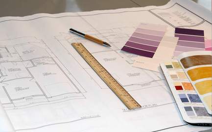 Designing a remodel is a critical process that takes thought and time. Designing a remodel is a critical process that takes thought and time. When I meet potential clients contemplating a remodel of their home or workplace, there is one common element that every one shares: Fear. For some people, it may be a fear of having to live in the absolute chaos that comes with such endeavors. It may be the fear of the cost of the work getting out of hand. It might be finding out that the contractor you hired isn’t capable of managing the process. It is not always easy to put those fears totally to rest. However there are certain actions that can help alleviate some of the distress, the anxiety and yes, some of the fear. Those actions can be put into context by several things that you should never do when approaching a remodel. Check out the 6 things you shouldn't do when you are contemplating a remodel. #1 Don’t be too anxious just because you are ready to make it all happen.
#2 Don’t rush into signing up the first contractor you meet.  First of all there are plenty of “Joes and Janes” with a pickup, toolbox and a hungry dog that will be glad to take your money. Some licensed, insured and bonded, some not. Don’t accept substitutions in the bidding process. It will add to the confusion when it comes time to comparing dollars. Slow down and do your research. Require a minimum of three references, call them and ask this one question, “Would you hire Joe or Jane again?” Ask to see projects they have done – in person. Contact the city offices to ensure they are licensed to perform such work in your area. Ask that copies of licenses, insurance and workmen’s compensation certificate are a part of the bid package. Compare estimates based on red apples to red apples and then consider your affinity towards one contractor over the others. #3 Don’t start without realistic expectations and a well researched budget.
The objective here is to establish realistic numbers. Take all the highest numbers then reduce that by 15%. That smaller number sets a budget; the 15% is to help cover the unexpected expenses. Use the lower set of numbers should you need to scale back the work. This is not a perfect science but it will provide a frame of reference on which to base your decisions. Make decisions based on value and quality, not just price. And remember this one bit of advice: The number one way to watch the cost of your remodeling project is product choices. Determine what you want to live with and then what you can live with that won’t sacrifice the outcomes and remember to make those decisions up front. #4 Don’t start until you have all the components in hand.  Once you make a decision to “just do it,” you want to see progress. But first things are first. Delays in projects we’ve seen are frequently due to slower-than-expected delivery dates for appliances, plumbing fixtures, even simple things like door hardware. When days and then weeks creep without progress, no one is going to be happy. Go through the design process first and choose and decide on everything in advance. This will define your budget and prevent hasty (and costly) decisions later in the project. Be sure to include all your product and material selections in the contract to avoid confusion and unnecessary change orders. Then make sure that every single item is sitting somewhere ready for the contractor to install prior to demolition. #5 Don’t take a back seat and leave it all to the experts to get it done.
# 6 Don’t call your neighbor, ask the handyman or get help at the hardware store. 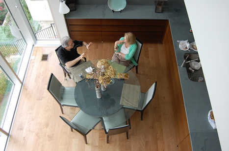 Understanding the client's needs is critical to a project's success. Understanding the client's needs is critical to a project's success. Mistakes, indecisions and delays can lead to confusion and more costs. Choose the experience of an interior design professional as your guidance counselor. It can prove to be beneficial to have an expert on your side, especially one who has dealt with the remodel process to help during those critical decision-making times. Think of hiring a professional designer as you would any accountant, physician or attorney. These experts are capable by their experience, education and examination to assist with making the right choices and proper selections and can become your advocate during disagreements. And if you’re still fearful, then you’re next step is to make a call to us. A “get-to-know-you” on-site visit is complimentary if you are in the Coachella Valley. We also work with many outside of our location in Palm Springs using the Internet, in fact as far away as New York, Chicago, Vancouver and Seattle. These days it is quite easy to help most clients with their projects, communicating with computer aided drawings, digital photos and video tools like Skype and FaceTime. For more information or to schedule an appointment, here is our contact info ..... VOICE: 760-322-3784 Extension 2# or / To drop us an email here... CLICK HERE Michael A. Thomas, FASID, CAPS is a nationally recognized interior designer, author and educator with more than 30 years in the profession. He is a Certified Aging In Place Specialist, the co-author of "Residential Design For Aging In Place" and a former National President of ASID. His work has been published and quoted in various media including Palm Springs Life, Houston Chronicle, Florida Home + Garden, Miami Herald, Dwell Magazine and extensively profiled in Interiors + Source magazine. He currently serves as the President of the Design Alliance for Accessible Sustainable Environments. From an office and studio in downtown Palm Springs, CA, his remodeling and new construction projects extend from southern California to Florida, from New York to Vancouver. Currently he is completing the design for the historic rehabilitation for the original Palm Springs library built in 1941, the Welwood Murray Memorial Library.
 By Michael A. Thomas, FASID, CAPS As the 76 million Baby Boomers being to approach their retirement, many will look back on decades gone by and remember the "good times." For them, and yes for all, there are those moments that one just can't forget.... mile-markers in time.... like our first true love, the first car, the first real job, maybe it was the first house you bought with a 30-year mortgage ( a commitment at the time which seemed like it would last forever. ) But especially for Boomers, there were many kinds of mile-markers during the 1970s. It was a time of change and huge social evolution. They were blazing trails and burning bridges,... sometimes at the same time. American novelist Tom Wolfe labeled the 1970s as “the Me Decade" and based this on the Boomer's newfound preoccupation with their own self-discovery and self-awareness. 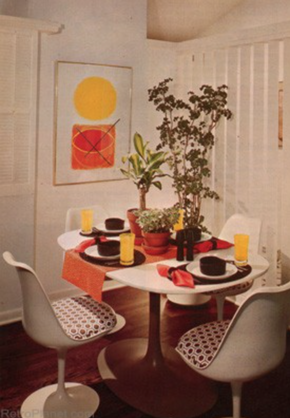 RADICAL CHANGE SOON BECAME THE NORM Here are some examples of how times have changed and how the times changed the lives of the Baby Boomer. Trendy home design during the early 1970s was considered "mod." Bright citrus colors replaced the classic1960's "boring beige" and "tired taupe." Chippendale cherry wood chairs and tables were tossed aside and replaced with seating and counters made from Lucite and Formica. While vertical slat and mini-slat blinds had been around but they become very popular during this era. Big prints and big plants filled our rooms. During this time, dishwashers were considered a real luxury and microwave ovens still seemed something from outer space. While we had color TV, there were only a handful of stations where I lived to choose from and only a few TV shows were in color. And depending on where you lived, TV stations signed off at midnight after playing the National Anthem. If you wanted to listen to specific music artist, there were vinyl records. You could buy about 14 songs on vinyl for about $ 5.99. ( My first was Carol King's Tapestry and I still have it.) Today, CD discs are "out," iTunes is "in" and vinyl is returning to favor. Wait, ... what happened there? This was also a time before fax machines, desk top computers, voice, emails and cell phones. It makes you wonder how we ever communicated with one another? Early Boomers were some of the first to raise concerns about the destruction of the planet's resources. Studies and reports released about air, land and water pollution led to marches, demonstrations and sit-ins which helped to give birth to the "sustainable" movement. We know it today as "green design," a popular trend in building that has become a standard design component. And speaking of giving birth, the Boomer generation was the first generation that thought it was perfectly fine to have a baby and then get married. And in July, 1978, the first test-tube baby was born which proved that you didn't even need a uterus to have one. Amazing, eh? WE GIVE THANKS TO THOSE RADICAL BOOMERS Those crazy years provided many milestones and memories for Boomers. Those years shaped who they were, what they believed, how they lived and what they became impacted our culture. So you say you're a Boomer but can't remember back then? Perhaps you weren't even born yet? Take a peak at what it was like in 1974 and see how things have changed,... or have they really?
And finally.... in 1974: we were saying "Whatever."
But now its 2014,... and we're saying "Depends." So if you're a Boomer, what's changed for you? What do you remember? by Michael A. Thomas, FASID, CAPS  Picking A Color Is A Process Not For The Weak. Picking A Color Is A Process Not For The Weak. After more than three decades as an interior designer, you’d think that choosing colors for walls, selecting upholstery fabrics and picking wall coverings would be a snap. But I confess. It isn’t. Color for one can be one very tricky beast and it is no wonder many interior designers ( and our clients ) worry so much about such things. I will also confess that have my favorite set of paint colors that provide certain expected results plus a number of basic fabrics and a collection of wall coverings that I know work well together or apart, no matter where they go, perform exceptionally well and yield no surprises. Yet when I do venture outside of my “favs,” I find that I can still struggle to ensure every design element will work successfully with one another. Take for example a current project. Our firm received the commission to design the interior of the original Palm Springs, CA. library. As I made final selections and wrote the specifications for woods, paints, fabrics and floors for the interior of the Welwood Murray Memorial Library, I continued to stress about one wood tone that seemed to shift occasionally from a “desert driftwood grey” to one with a decidedly pink undertone. Having a critical color eye along with managing the evolutionary aspects of a project and being responsible for the end product has always been in my daily job description, one that clients generally take for granted. However when you suddenly wake up at three in the morning and worry about a color shifting to pink, (...technically... due i part to an altered color rendering index and light reflective values going from 85 to 75,) I knew a change in wood finish would be necessary. You know....Designers actually have anxiety attacks and worry about such things even if others do not. Seriously! Why do you think my grey hair now has a light reflective value of 94?
 Not EveryBody Sees Color In The Same Way There are many factors that impact how the human eye interprets a color. Colors can shift unexpectedly depending on several factors: texture of the surface, the direction of natural light from windows and doors; the time of day, color temperatures from artificial light sources like table lamps and overhead ceiling fixtures and surrounding finishes. There are other factors involved that include one’s age, the health of the eyes, blood pressure and such things as cataracts that shifts how we perceive colors slowly over time. And being in the sun can alter the way the brain sees certain colors, for some, even changing more intense and brilliant colors to grays. In the case of the mysteriously shifting driftwood grey at the library, it was finally determined that the color shift came from the wood species itself, a flat cut red oak and not from the color of the stain. Changing from oak to hickory, a species that has a natural grey cast and using the same stain was the solution. And now with that change, I sleep better. 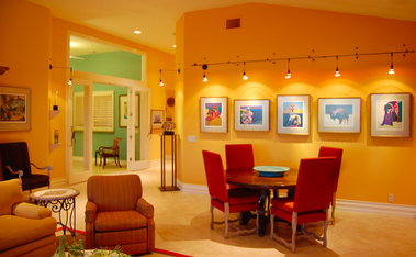 Color Is How You Light It. So how do you find a color is that is just perfect? Here are five tips that will help to make your choice just a little easier. (#1) After making your selections, confirm your final colors based on the two light sources: natural light ( at straight up noon on a clear day is my preference as the color temperature is very high and white) and then under what ever artificial light will be in the room,… be it incandescent, florescent, halogen or LEDs. Each have quite different color temperatures and each will make colors look vastly different from one another. (#2) Samples of paints, flooring and fabrics are necessary but bigger samples that showcase actual texture or finish are an absolute. For example, texture may darken how a color appears because of the shadows within the texture or weave; finishes, especially shinier ones tend to appear lighter. For washed out or pastel tones, I tend to choose ultra-flat finishes as I like a “chalk-y” appearance. For deeper tones, I enjoy seeing satin to nearly shiny finishes on walls and floors as the light bouncing off will make an interior seems brighter. (#3) Certain colors like pink and for some people like me, blue, are especially difficult to get just right. Those basic neutral hues like greige and soft browns can also get tricky. So one technique is to place the selected two or three color choices against a totally black background then against a pure white background. Doing this can help identify potential color shifts. And when looking at a color in a paint deck, to check out the truest color tint, look at the darkest color on the strip. This color has the most color saturation and you can see the true base color much more easily. (#4) Don’t, repeat don’t go to the big-box stores and choose your colors. You will only set yourself up for paint-rack confusion. First consider colors in your current environment and ones that draw your attention. My home is filled with accents of rust, paprika and brown-black and bronze colors in the art collection so it was easy to select paint colors, fabrics and wood colors in white, silvers and grey tones for the backgrounds that contrast with the art. (#5) And finally, when in total doubt, let your decision rest. I find that when I “try” too hard to make a decision right then and there and perhaps even force a decision, there can be regret. So put things aside, go on to other tasks, let your eyes rest and then come back and review once again. Follow these techniques and you’ll discover that selecting the “perfect” shade, tone and depth of color will be easier to accomplish and less of a pain in the paint. Choosing colors should not be rocket science, but rather an application of a science to the process. |
Michael is an award winning interior designer based in Palm Desert, CA. He is a Professional Member of the American Society of Interior Designers and a member of the ASID College of Fellows.
As a Certified Aging In Place Specialist, he creates smart looking spaces that are safe and secure and create homes for a lifetime. And with thirty plus years in the profession, he has honed his humor, elevated his passion for design and sharpened his wit to not take anything too seriously except his design work. Archives
February 2023
Categories
All
|


 RSS Feed