|
by Michael A. Thomas, FASID, CAPS  Picking A Color Is A Process Not For The Weak. Picking A Color Is A Process Not For The Weak. After more than three decades as an interior designer, you’d think that choosing colors for walls, selecting upholstery fabrics and picking wall coverings would be a snap. But I confess. It isn’t. Color for one can be one very tricky beast and it is no wonder many interior designers ( and our clients ) worry so much about such things. I will also confess that have my favorite set of paint colors that provide certain expected results plus a number of basic fabrics and a collection of wall coverings that I know work well together or apart, no matter where they go, perform exceptionally well and yield no surprises. Yet when I do venture outside of my “favs,” I find that I can still struggle to ensure every design element will work successfully with one another. Take for example a current project. Our firm received the commission to design the interior of the original Palm Springs, CA. library. As I made final selections and wrote the specifications for woods, paints, fabrics and floors for the interior of the Welwood Murray Memorial Library, I continued to stress about one wood tone that seemed to shift occasionally from a “desert driftwood grey” to one with a decidedly pink undertone. Having a critical color eye along with managing the evolutionary aspects of a project and being responsible for the end product has always been in my daily job description, one that clients generally take for granted. However when you suddenly wake up at three in the morning and worry about a color shifting to pink, (...technically... due i part to an altered color rendering index and light reflective values going from 85 to 75,) I knew a change in wood finish would be necessary. You know....Designers actually have anxiety attacks and worry about such things even if others do not. Seriously! Why do you think my grey hair now has a light reflective value of 94?
 Not EveryBody Sees Color In The Same Way There are many factors that impact how the human eye interprets a color. Colors can shift unexpectedly depending on several factors: texture of the surface, the direction of natural light from windows and doors; the time of day, color temperatures from artificial light sources like table lamps and overhead ceiling fixtures and surrounding finishes. There are other factors involved that include one’s age, the health of the eyes, blood pressure and such things as cataracts that shifts how we perceive colors slowly over time. And being in the sun can alter the way the brain sees certain colors, for some, even changing more intense and brilliant colors to grays. In the case of the mysteriously shifting driftwood grey at the library, it was finally determined that the color shift came from the wood species itself, a flat cut red oak and not from the color of the stain. Changing from oak to hickory, a species that has a natural grey cast and using the same stain was the solution. And now with that change, I sleep better. 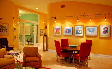 Color Is How You Light It.
So how do you find a color is that is just perfect? Here are five tips that will help to make your choice just a little easier. (#1) After making your selections, confirm your final colors based on the two light sources: natural light ( at straight up noon on a clear day is my preference as the color temperature is very high and white) and then under what ever artificial light will be in the room,… be it incandescent, florescent, halogen or LEDs. Each have quite different color temperatures and each will make colors look vastly different from one another. (#2) Samples of paints, flooring and fabrics are necessary but bigger samples that showcase actual texture or finish are an absolute. For example, texture may darken how a color appears because of the shadows within the texture or weave; finishes, especially shinier ones tend to appear lighter. For washed out or pastel tones, I tend to choose ultra-flat finishes as I like a “chalk-y” appearance. For deeper tones, I enjoy seeing satin to nearly shiny finishes on walls and floors as the light bouncing off will make an interior seems brighter. (#3) Certain colors like pink and for some people like me, blue, are especially difficult to get just right. Those basic neutral hues like greige and soft browns can also get tricky. So one technique is to place the selected two or three color choices against a totally black background then against a pure white background. Doing this can help identify potential color shifts. And when looking at a color in a paint deck, to check out the truest color tint, look at the darkest color on the strip. This color has the most color saturation and you can see the true base color much more easily. (#4) Don’t, repeat don’t go to the big-box stores and choose your colors. You will only set yourself up for paint-rack confusion. First consider colors in your current environment and ones that draw your attention. My home is filled with accents of rust, paprika and brown-black and bronze colors in the art collection so it was easy to select paint colors, fabrics and wood colors in white, silvers and grey tones for the backgrounds that contrast with the art. (#5) And finally, when in total doubt, let your decision rest. I find that when I “try” too hard to make a decision right then and there and perhaps even force a decision, there can be regret. So put things aside, go on to other tasks, let your eyes rest and then come back and review once again. Follow these techniques and you’ll discover that selecting the “perfect” shade, tone and depth of color will be easier to accomplish and less of a pain in the paint. Choosing colors should not be rocket science, but rather an application of a science to the process.
2 Comments
Barb Leifer
7/4/2014 01:31:30 am
Michael, I always enjoy reading your blogs. So do you have a favorite color? I have to repaint soon and want to explore something new. Any advice appreciated. 7/4/2014 01:40:57 am
Barb... thank you for your compliment. For me, you can beat a neutral interior paint color. From off-whites to deep tone beiges to driftwood grays. I have never been a fan of having a lot of color on walls unless used as an accent. But it also doesn't mean you have to go without some color on the main walls. One of my all time favorite colors is Benjamin Moore "Oklahoma Wheat." It is a warm sunny classic yellow color that is just neutral enough to go with everything. Leave a Reply. |
 .................................................
• Michael A. Thomas, CAPS, FASID is a passionate interior designer that constantly examines the impact design has on the human experience. Michael is an award winning interior designer based in Palm Desert, CA. He is a Professional Member of the American Society of Interior Designers and a member of the ASID College of Fellows.
As a Certified Aging In Place Specialist, he creates smart looking spaces that are safe and secure and create homes for a lifetime. And with thirty plus years in the profession, he has honed his humor, elevated his passion for design and sharpened his wit to not take anything too seriously except his design work. 
Archives
February 2023
Categories
All
|
 RSS Feed