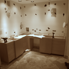
By Michael A. Thomas, FASID, CAPS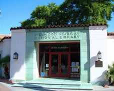 The Welwood Murray Memorial Library The Welwood Murray Memorial Library What an exciting time to live, work or visit Palm Springs with so many great things happening about town. The decades old mall has given away to a new vision for downtown shopping and dining. Numerous hotels are in the works scattered about offering even more inviting accommodations. And now the historic Welwood Murray Memorial Library, the original Palm Springs library building originally designed by John Porter Clark in 1941 will be reopened very early next year. And no matter whether you are a full-timer like myself, a snowbird, snowflake or weekend tourist, you have to be excited about all this renaissance going on. It is both awesome and amazing. As the interior designer commissioned to work with the City of Palm Springs, the Library Board of Trustees and local renowned architect, William Kleindienst, I wanted to share a peak of the progress being made. The remodeling process began in earnest in late May of this year. There was actually very little left of the original interior, a few pistachio-green stained pine bookcases, a dumb-waiter and yellowed florescent light fixtures. Old plaster ceilings were removed to rid the space of asbestos. What did remain however after the library was shuttered years ago was ghost-print of the original library reception desk, clearly outlined in the stained concrete floor. SWEET ! Much of the demo is now complete. The old concrete slab was carefully cut open for the installation of a new high efficient air conditioning system along with new electrical, data and phone lines. In the upcoming weeks, concrete will be poured to cover the completed mechanical systems, fill the large cavity, provide a new fresh floor and new concrete finish not so unlike the original. 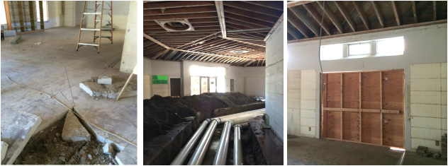 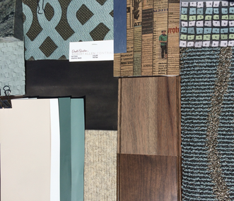 Furnishings + Fabrics Will Be Both Classic + Modern. Furnishings + Fabrics Will Be Both Classic + Modern. Next interior framing will segment open spaces into the much needed archives and offices of the Palm Springs Historical Society, a library staff office, staff meeting room, small kitchenette and a staff bath. In the east wing of the building, a community meeting room complete with audio-video equipment and seating for 40 will give groups a small place for meetings and events. The design of the interior is now complete after receiving required approvals from the stakeholders and governing councils. Whew! The final tweaks to the interior specifications are being made as we go to press with this post. • And the style of the interior?... A bit understated, quiet and clean, classic and modern at the same time and to not detract from the design of the building. The interior will be presented against a background of grey-beige and warm mocha colors, accented with a “pistachio” color, a color element discovered during our design development stage, an agave-hued tone used in the original scheme of the Welwood. 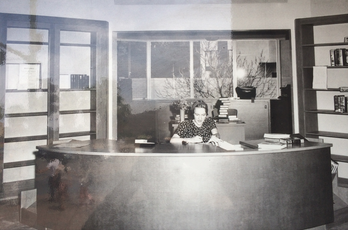 The Original Reception Desk With A "Faux Leather" Face The Original Reception Desk With A "Faux Leather" Face The furnishings, fixtures and equipment will provide flexibility to accommodate a variety of users and set the stage for a facility that is expected to be enjoyed daily by many including locals, tourists, historical researchers and for some, just a place to hang out, read the daily news or catch up on local gossip. When entering the threshold of the angled main entrance to the building, a curved reception desk will greet visitors. The design is taking its general shape, size, and materials gleaned from old photos yet updating the design to reflect the expanded use of the desk by staffers and to comply with ADA regulations. Plus we’ve designed the large desk to be positioned just exactly as it was when the library opened in 1941, carefully measuring the ghost-print on the floor just prior to the demo of the concrete slab. SWEET ! One of the more remarkable elements of the original desk was the use of a "faux-leather" or "fabrictoid" material on the front face, a product that had just come on the market in the 1930s. We know it today as vinyl or one of the trade-marked names : Naugahyde.  Interior Perspective Looking East In Welwood's Grand Hall Interior Perspective Looking East In Welwood's Grand Hall Glass enclosed display cases will provide the historical society and library staff members with areas to showcase artifacts, photos and books from days gone by. Standing tables will have charging ports for laptop computers and mobile phones. Both modern and "Moderne" style seating will offer visitors a variety of options, from comfortable lounges to reading chairs to bar stools. And we have specified durable, innovative, sustainable materials and products in the design such as recycled paper for countertops, low VOC paint finishes and special warm-white LED lighting in pendant, table top and wall sconce lighting that will comply with California's energy codes and generally help to reduce maintenance costs. . . . . . . . . . . . . . . . . . . . . . . . . . . . . . . . . . . . . . • So that is the current update on the progress and the plans for the rehabilitation of this historic building in the heart of downtown. Look for a new update in the just after Labor Day with more details on the remodeling progress of the Welwood.
Yes, what a great time to be in PS and to see all of this renaissance happening, all right in the heart of Palm Springs. • Pretty Sweet, eh? ( If you missed the prior post about design and the official kick-off party a few weeks ago, CLICK HERE.)
4 Comments
By Michael A. Thomas, FASID, CAPS 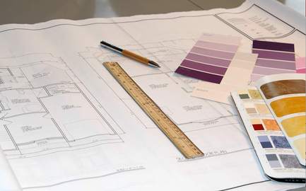 Designing a remodel is a critical process that takes thought and time. Designing a remodel is a critical process that takes thought and time. When I meet potential clients contemplating a remodel of their home or workplace, there is one common element that every one shares: Fear. For some people, it may be a fear of having to live in the absolute chaos that comes with such endeavors. It may be the fear of the cost of the work getting out of hand. It might be finding out that the contractor you hired isn’t capable of managing the process. It is not always easy to put those fears totally to rest. However there are certain actions that can help alleviate some of the distress, the anxiety and yes, some of the fear. Those actions can be put into context by several things that you should never do when approaching a remodel. Check out the 6 things you shouldn't do when you are contemplating a remodel. #1 Don’t be too anxious just because you are ready to make it all happen.
#2 Don’t rush into signing up the first contractor you meet.  First of all there are plenty of “Joes and Janes” with a pickup, toolbox and a hungry dog that will be glad to take your money. Some licensed, insured and bonded, some not. Don’t accept substitutions in the bidding process. It will add to the confusion when it comes time to comparing dollars. Slow down and do your research. Require a minimum of three references, call them and ask this one question, “Would you hire Joe or Jane again?” Ask to see projects they have done – in person. Contact the city offices to ensure they are licensed to perform such work in your area. Ask that copies of licenses, insurance and workmen’s compensation certificate are a part of the bid package. Compare estimates based on red apples to red apples and then consider your affinity towards one contractor over the others. #3 Don’t start without realistic expectations and a well researched budget.
The objective here is to establish realistic numbers. Take all the highest numbers then reduce that by 15%. That smaller number sets a budget; the 15% is to help cover the unexpected expenses. Use the lower set of numbers should you need to scale back the work. This is not a perfect science but it will provide a frame of reference on which to base your decisions. Make decisions based on value and quality, not just price. And remember this one bit of advice: The number one way to watch the cost of your remodeling project is product choices. Determine what you want to live with and then what you can live with that won’t sacrifice the outcomes and remember to make those decisions up front. #4 Don’t start until you have all the components in hand.  Once you make a decision to “just do it,” you want to see progress. But first things are first. Delays in projects we’ve seen are frequently due to slower-than-expected delivery dates for appliances, plumbing fixtures, even simple things like door hardware. When days and then weeks creep without progress, no one is going to be happy. Go through the design process first and choose and decide on everything in advance. This will define your budget and prevent hasty (and costly) decisions later in the project. Be sure to include all your product and material selections in the contract to avoid confusion and unnecessary change orders. Then make sure that every single item is sitting somewhere ready for the contractor to install prior to demolition. #5 Don’t take a back seat and leave it all to the experts to get it done.
# 6 Don’t call your neighbor, ask the handyman or get help at the hardware store.  Understanding the client's needs is critical to a project's success. Understanding the client's needs is critical to a project's success. Mistakes, indecisions and delays can lead to confusion and more costs. Choose the experience of an interior design professional as your guidance counselor. It can prove to be beneficial to have an expert on your side, especially one who has dealt with the remodel process to help during those critical decision-making times. Think of hiring a professional designer as you would any accountant, physician or attorney. These experts are capable by their experience, education and examination to assist with making the right choices and proper selections and can become your advocate during disagreements. And if you’re still fearful, then you’re next step is to make a call to us. A “get-to-know-you” on-site visit is complimentary if you are in the Coachella Valley. We also work with many outside of our location in Palm Springs using the Internet, in fact as far away as New York, Chicago, Vancouver and Seattle. These days it is quite easy to help most clients with their projects, communicating with computer aided drawings, digital photos and video tools like Skype and FaceTime. For more information or to schedule an appointment, here is our contact info ..... VOICE: 760-322-3784 Extension 2# or / To drop us an email here... CLICK HERE Michael A. Thomas, FASID, CAPS is a nationally recognized interior designer, author and educator with more than 30 years in the profession. He is a Certified Aging In Place Specialist, the co-author of "Residential Design For Aging In Place" and a former National President of ASID. His work has been published and quoted in various media including Palm Springs Life, Houston Chronicle, Florida Home + Garden, Miami Herald, Dwell Magazine and extensively profiled in Interiors + Source magazine. He currently serves as the President of the Design Alliance for Accessible Sustainable Environments. From an office and studio in downtown Palm Springs, CA, his remodeling and new construction projects extend from southern California to Florida, from New York to Vancouver. Currently he is completing the design for the historic rehabilitation for the original Palm Springs library built in 1941, the Welwood Murray Memorial Library.
 By Michael A. Thomas, FASID, CAPS As the 76 million Baby Boomers being to approach their retirement, many will look back on decades gone by and remember the "good times." For them, and yes for all, there are those moments that one just can't forget.... mile-markers in time.... like our first true love, the first car, the first real job, maybe it was the first house you bought with a 30-year mortgage ( a commitment at the time which seemed like it would last forever. ) But especially for Boomers, there were many kinds of mile-markers during the 1970s. It was a time of change and huge social evolution. They were blazing trails and burning bridges,... sometimes at the same time. American novelist Tom Wolfe labeled the 1970s as “the Me Decade" and based this on the Boomer's newfound preoccupation with their own self-discovery and self-awareness. 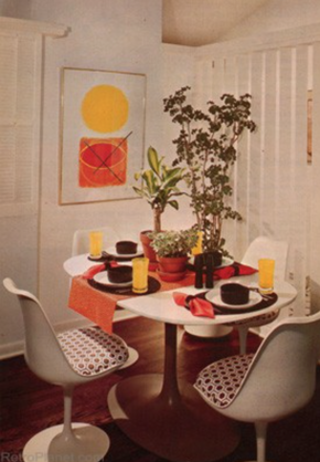 RADICAL CHANGE SOON BECAME THE NORM Here are some examples of how times have changed and how the times changed the lives of the Baby Boomer. Trendy home design during the early 1970s was considered "mod." Bright citrus colors replaced the classic1960's "boring beige" and "tired taupe." Chippendale cherry wood chairs and tables were tossed aside and replaced with seating and counters made from Lucite and Formica. While vertical slat and mini-slat blinds had been around but they become very popular during this era. Big prints and big plants filled our rooms. During this time, dishwashers were considered a real luxury and microwave ovens still seemed something from outer space. While we had color TV, there were only a handful of stations where I lived to choose from and only a few TV shows were in color. And depending on where you lived, TV stations signed off at midnight after playing the National Anthem. If you wanted to listen to specific music artist, there were vinyl records. You could buy about 14 songs on vinyl for about $ 5.99. ( My first was Carol King's Tapestry and I still have it.) Today, CD discs are "out," iTunes is "in" and vinyl is returning to favor. Wait, ... what happened there? This was also a time before fax machines, desk top computers, voice, emails and cell phones. It makes you wonder how we ever communicated with one another? Early Boomers were some of the first to raise concerns about the destruction of the planet's resources. Studies and reports released about air, land and water pollution led to marches, demonstrations and sit-ins which helped to give birth to the "sustainable" movement. We know it today as "green design," a popular trend in building that has become a standard design component. And speaking of giving birth, the Boomer generation was the first generation that thought it was perfectly fine to have a baby and then get married. And in July, 1978, the first test-tube baby was born which proved that you didn't even need a uterus to have one. Amazing, eh? WE GIVE THANKS TO THOSE RADICAL BOOMERS Those crazy years provided many milestones and memories for Boomers. Those years shaped who they were, what they believed, how they lived and what they became impacted our culture. So you say you're a Boomer but can't remember back then? Perhaps you weren't even born yet? Take a peak at what it was like in 1974 and see how things have changed,... or have they really?
And finally.... in 1974: we were saying "Whatever."
But now its 2014,... and we're saying "Depends." So if you're a Boomer, what's changed for you? What do you remember? by Michael A. Thomas, FASID, CAPS  Picking A Color Is A Process Not For The Weak. Picking A Color Is A Process Not For The Weak. After more than three decades as an interior designer, you’d think that choosing colors for walls, selecting upholstery fabrics and picking wall coverings would be a snap. But I confess. It isn’t. Color for one can be one very tricky beast and it is no wonder many interior designers ( and our clients ) worry so much about such things. I will also confess that have my favorite set of paint colors that provide certain expected results plus a number of basic fabrics and a collection of wall coverings that I know work well together or apart, no matter where they go, perform exceptionally well and yield no surprises. Yet when I do venture outside of my “favs,” I find that I can still struggle to ensure every design element will work successfully with one another. Take for example a current project. Our firm received the commission to design the interior of the original Palm Springs, CA. library. As I made final selections and wrote the specifications for woods, paints, fabrics and floors for the interior of the Welwood Murray Memorial Library, I continued to stress about one wood tone that seemed to shift occasionally from a “desert driftwood grey” to one with a decidedly pink undertone. Having a critical color eye along with managing the evolutionary aspects of a project and being responsible for the end product has always been in my daily job description, one that clients generally take for granted. However when you suddenly wake up at three in the morning and worry about a color shifting to pink, (...technically... due i part to an altered color rendering index and light reflective values going from 85 to 75,) I knew a change in wood finish would be necessary. You know....Designers actually have anxiety attacks and worry about such things even if others do not. Seriously! Why do you think my grey hair now has a light reflective value of 94?
 Not EveryBody Sees Color In The Same Way There are many factors that impact how the human eye interprets a color. Colors can shift unexpectedly depending on several factors: texture of the surface, the direction of natural light from windows and doors; the time of day, color temperatures from artificial light sources like table lamps and overhead ceiling fixtures and surrounding finishes. There are other factors involved that include one’s age, the health of the eyes, blood pressure and such things as cataracts that shifts how we perceive colors slowly over time. And being in the sun can alter the way the brain sees certain colors, for some, even changing more intense and brilliant colors to grays. In the case of the mysteriously shifting driftwood grey at the library, it was finally determined that the color shift came from the wood species itself, a flat cut red oak and not from the color of the stain. Changing from oak to hickory, a species that has a natural grey cast and using the same stain was the solution. And now with that change, I sleep better.  Color Is How You Light It.
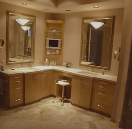
So how do you find a color is that is just perfect? Here are five tips that will help to make your choice just a little easier. (#1) After making your selections, confirm your final colors based on the two light sources: natural light ( at straight up noon on a clear day is my preference as the color temperature is very high and white) and then under what ever artificial light will be in the room,… be it incandescent, florescent, halogen or LEDs. Each have quite different color temperatures and each will make colors look vastly different from one another. (#2) Samples of paints, flooring and fabrics are necessary but bigger samples that showcase actual texture or finish are an absolute. For example, texture may darken how a color appears because of the shadows within the texture or weave; finishes, especially shinier ones tend to appear lighter. For washed out or pastel tones, I tend to choose ultra-flat finishes as I like a “chalk-y” appearance. For deeper tones, I enjoy seeing satin to nearly shiny finishes on walls and floors as the light bouncing off will make an interior seems brighter. (#3) Certain colors like pink and for some people like me, blue, are especially difficult to get just right. Those basic neutral hues like greige and soft browns can also get tricky. So one technique is to place the selected two or three color choices against a totally black background then against a pure white background. Doing this can help identify potential color shifts. And when looking at a color in a paint deck, to check out the truest color tint, look at the darkest color on the strip. This color has the most color saturation and you can see the true base color much more easily. (#4) Don’t, repeat don’t go to the big-box stores and choose your colors. You will only set yourself up for paint-rack confusion. First consider colors in your current environment and ones that draw your attention. My home is filled with accents of rust, paprika and brown-black and bronze colors in the art collection so it was easy to select paint colors, fabrics and wood colors in white, silvers and grey tones for the backgrounds that contrast with the art. (#5) And finally, when in total doubt, let your decision rest. I find that when I “try” too hard to make a decision right then and there and perhaps even force a decision, there can be regret. So put things aside, go on to other tasks, let your eyes rest and then come back and review once again. Follow these techniques and you’ll discover that selecting the “perfect” shade, tone and depth of color will be easier to accomplish and less of a pain in the paint. Choosing colors should not be rocket science, but rather an application of a science to the process.  After a long period of decline in the real estate market since 2007, sales of residential property in the Coachella Valley are showing signs of life once again. But it doesn’t mean the marketplace is out of the woods just yet. While there have been a respectable number of home sales during the last half of 2013 and well into the first quarter of 2014, those sales reflect a marketplace that remains in a state of flux. Buyers are certainly out there with dollars to spend but they are looking more strategically for good buys, the condition of the home and of course location, location, location. Here is the good news and the not so good news. The median sales price in the entire Valley rose more than 5 percent in the first three months of 2014, a sign that is encouraging. But that wasn’t the case for every desert city. While prices increased in Indio, La Quinta, Palm Desert, Desert Hot Springs and Indian Wells, home sales in Palm Springs, Cathedral City and Rancho Mirage declined. 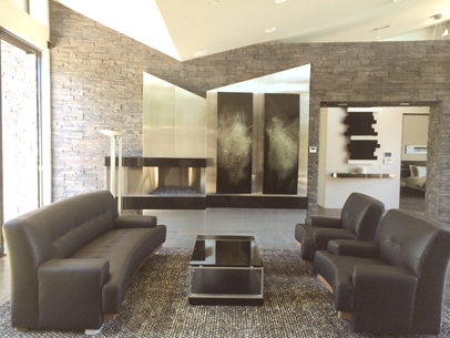 One of our recent remodels included a new focal point and fireplace. One of our recent remodels included a new focal point and fireplace. Big Difference in High End And Low End Markets. In data published by Market Watch, a real estate advisory firm, there are two distinct housing markets in the valley. No surprise there when locals who live, work and raise families here differ economically from those who come to the desert to retire full time or who are looking for second homes and leisure properties. As one example, the number of property sales above $700,000 rose more than 50 percent during this last season while homes under $300,000 stumbled along and in some areas even continued to decline. Other data clearly indicates that the higher-end market will continue to expand as people discover desert living, many who will use cash rather than loans to make their purchase. Part of the reason for the decline in the number of lower-end homes sales is that investors are just no longer finding those bargain basement prices that were the result of short sales and foreclosures. In fact, only 10 percent of recent sales were for distressed properties. That market place seems to be drying up as the economy gets back on its feet. While some of the housing market is being held back due to a lack of jobs and in general the slowly growing economy, Market Watch continues to indicate a stable housing market for the Valley in the months and few years ahead which is certainly better news than in the past 48 months.  A remodeled bathroom adds both value and enjoyment. A remodeled bathroom adds both value and enjoyment. A Little Bit Of Advice From An Expert
So is this a good time to buy? Much depends on one’s own goals. If you want a home that is in great condition, has low maintenance and in an area that compliments your lifestyle, expect to shell out some dollars. There continue to be many nice homes in the Coachella market that are move-in ready or can be with some simple and basic updates. But if you are willing to buy something that needs a little tender loving care, our advice to our clients is always clear. • Take your time. • Define your expectations. • Plan it all out on paper before making that commitment. With two decades of experience and dozens of remodeling projects under our belt, we have seen remodeling costs get out of control without plans in place as a control. And as a very general rule, projects can easily range from $40 to $225 per square foot depending on the scope of work. But when they exceed the top end of costs, the value can be hard to recoup at the time of resale. Our experience also reminds that it is far better to know what kind of dollars will be necessary up front long before you sign on that purchase offer and not “over-design” for the neighborhood. According to several sources, remodeling projects that provide the greatest returns on the dollars invested include not surprisingly, the master bathroom and kitchen since these can be disruptive undertakings yet return as much as 80% of those costs at the time of resale. If the prospective home’s bone structure is in good shape and the layout is well designed, then something as basic as a new coat of paint or installing new floor, wall and window coverings will make the interior fresh and ready for your occupancy. Finally, above all…. remember the old adage, location, location, and location. In other words, the area the property is located in is as important as almost anything else,… so important that everything else you could say about it hardly matters. So plan wisely now and for your future here in the desert. By Michael A. Thomas, FASID, CAPS, CASE Michael is a well known and established interior designer with more than 30 years in the profession. He is a Certified Aging In Place Specialist, the co-author of "Residential Design For Aging In Place" and a former National President of ASID. His work has been published and quoted in various media including Palm Springs Life, Houston Chronicle, Florida Home + Garden, Miami Herald, Dwell Magazine and extensively profiled in Interiors + Source magazine. He currently serves as the President of the Design Alliance for Accessible Sustainable Environments. From an office and studio in downtown Palm Springs, CA, his remodeling and new construction projects extend from southern California to Florida, from New York to Vancouver. Currently he is completing the design for the historic rehabilitation for the original Palm Springs library built in 1941, the Welwood Murray Memorial Library.  By Michael A. Thomas, FASID, CAPS I have to share something. Being creative usually isn't the challenge when it comes to designing interiors. It is staying inspired that is the challenge. The profession of design isn’t always easy. To be organized, run a sound and profitable business, work with a variety of people, assemble unique solutions for client projects and ensuring the work will get done promptly requires a source of inspiration on a continuing basis. And then there is just getting around to see new products, learning about new technologies and understanding new ways to produce solutions are necessary in order to produce inspired spaces. Thanks to a variety of trade events and conferences, there is little excuse for design professionals in search of inspiration. 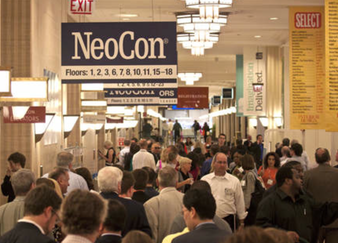 • For those of us designers who create office and corporate interiors, The NeoCon trade show brings together 40,000 trade over three very hectic days and scatters them about in highly styled showrooms in the world’s largest building, the Merchandise Mart in downtown Chicago. This annual event showcases the finest in workplace environments. Big office furniture vendors such as Steelcase, Herman Miller and Haworth spend huge bucks to provide inspiration for interior designers. After all, one main objective of the design process to create an effective workspace is crafting solutions to raise the performance and productivity of employees. Locating and specifying just the right staff chair – when there can be 200 or 2000 of them – can have a direct and sometimes dramatic impact on a client’s bottom line.  Trends at last week’s NeoCon continued to highlight open collaborative workspaces over individual offices and cubicles, a direction that has continued for the last few years. What did we see? Colors were clear, bold and in-your-face. Styles were decidedly contemporary over the stuffy 18th Century styles typically seen in traditional law offices. And the talk among the members of the design community is that things are looking up. Not great yet... but certainly better than in the past few years. About time, eh?  • Another show of note is the International Contemporary Furniture Fair held at the Jacob Javitz in New York held each May. Being at this show – and of course in the heart of Manhattan – provides a wealth of inspiration. This event showcases the creativity of emerging vendors, small manufacturers and individual craftspeople. One of the benefits of this show is that it gives “little people” a chance to present their work to a large number of design professionals. 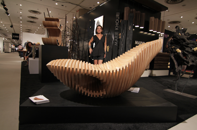 What did we see? Products at this year’s event featured natural, organic and sustainable themes. Metal tables, unglazed ceramics, natural wood cabinets, hand made fabrics and woven floor coverings, each made from unbleached, raw and unrefined materials filled the nearly 250 booths. This lounge chair was eye catching, a one of a kind piece by Marie Khouri. Made in maple with a clear stain, it was as comfortable as it was great looking.  • Upcoming is one of my favorite shows and one produced by Dwell Magazine. This conference and event, Dwell On Design, located at the LA Convention Center starting on June 20th is a premier event for contemporary interior design, furnishings and fixtures, architecture and landscape. This year, the show will feature both green “sustainable” concepts and “aging-in-place designs. Innovative products, educational workshops, home tours and design lectures will attract the attention of an estimated 50,000 design professionals, clients and consumers.  For a second year in a row, I am pleased to be a workshop presenter along with colleague and interior designer, Kerrie Kelly. This Saturday, we will be speaking about the upcoming trend of designing homes that last a lifetime and how by making an interior free of architectural barriers, one can increase personal safety and security. I’m excited to offer two case studies of client projects that blend both sustainable designs and “aging in place” solutions into one singular solution. And on Sunday afternoon, I will be volunteering for my professional society, ASID, and offer free design consultations. Stop by the ASID booth to sign up for a free one-on-one design consultation. 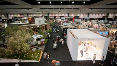 Dwell On Design continues to expand and this year is no exception with nearly 85,000 feet of design displays, modular homes, and innovative products. In my opinion, this three-day event will have endless inspiration for design professionals and consumers. For more information on the show or to sign up for the lectures and tours, here is the link: www.DwellOnDesign.com  • So as you can see, there are plenty ways to become and stay inspired. There are no less than two dozen other venues and conferences… like the International Builder Show, the Kitchen and Bath Industry Show, the Hospitality Design Conference, the twice-a-year High Point Furniture Market, the American Crafts Council Show and the summer and winter markets at both the Dallas Market Center and the World Market Center in Las Vegas.
The quandary it seems for me is to select venues that will have the products, technologies and thinking in line with the projects one is working on at the time. It is a challenge to know what shows to register for since each are a major investment of travel, time and dollars. Oh and one more thing… another challenge is just finding the time to be away from the office for several days at a time. Clients sometimes get pesky. And our subs do to • But its what we must do to stay inspired. • Its what we do for our clients. • We inspire them with new ways to live.  "These shows make decorating seem so real and easy." "These shows make decorating seem so real and easy." If you run around with “designer” types as I sometimes do, a conversation often sparks up about celebrity designers and decorators. As a professional designer for three decades, I have very little respect for those self-styled, celeb-styled decorettes whose only claim to fame is their ability to smile on cue for moan-and-bicker reality TV. The class of professional I am referring to are the ones that have made an impact in design and had influence over the trend du jour, penciling and sketching whole new ways of designing spaces that would become uniquely their own. Certainly Elsie De Wolfe comes first to my mind. She challenged the decorating conventions of her day, reinvented how spaces were to be used and made up rules as she saw fit. Many know her as the “Mother” of decorating. And then there was Dorothy Draper who helped inspire a generation of home improvement devotees with her 1939 book, Decorating is Fun!, subtitled "How to Be Your Own Decorator." The book was a popular diversion for house-bound wives looking for ways to "feather" their nests. 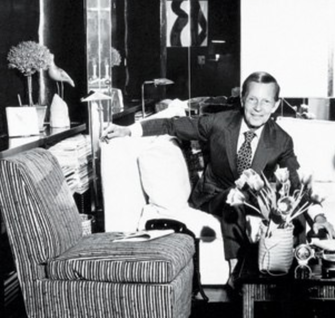 Billy Baldwin led the way for men to enter the profession. Billy Baldwin led the way for men to enter the profession. But for me, one "decorating" legend that is not remembered as much is William Baldwin, Jr., the “Father” of interior design, and the first “male” designer to achieve such fame. Baldwin, or Billy B. as he was known to clients and friends, was a classicist, a modernist and a man of strong likes and dislikes. Not one to hold back, he was known to verbalize his disdain for the baroque and rococo, in fact,... just about anything that was stuck in the 18th Century. His pet aversions were jumble, clutter and ostentation of any kind. In an interview he once said, “The word that almost makes me throw up is satin; damask makes me throw up.'' He was born in 1903 and studied architecture at Princeton but that only lasted two years. He then worked, unhappily he said, in his father's insurance agency, while reading everything he could find about interior decorating. By the late 1920's he had built up a decorating clientele in Baltimore and was growing quite popular among the elite. 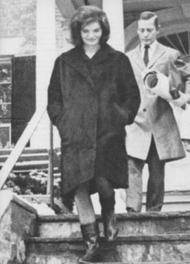 Jackie "O" with Baldwin exits her NY townhouse. Jackie "O" with Baldwin exits her NY townhouse. Early on in his career, he defined a smart, dapper personal style that favored a clean-cut, hard-edged form combined with a nearly immaculate and pared-down aesthetic. He often mixed the ordinary with the exotic. When the top decorator of the time, Ruby Ross Wood, asked Baldwin to work for her in 1935, she said she had never thought of hiring a man. In those days, all the leading decorators were women. But it was thru his successes as the leading designer during the early and mid-century that did much to open the art of decorating and the profession of design to men. His unique style attracted celeb-clients including Cole Porter, Greta Garbo, Mike Nichols and Diana Vreeland. Probably his most notable clients were John and Jacqueline Kennedy. He had the honor to serve the President and First Lady in guiding some of the restoration of the White House during the early 1960s. I first came to know of Baldwin when I purchased a copy of his first book, Billy Baldwin Decorates. In that book published in 1972 (I still covet my first edition copy), toward the front is a photograph of a grand entrance hall. That image of a high-styled space with a black and white checkerboard marble floor and a gleaming white painted sweeping staircase has, for me, remained the epitome of timelessness. Increasingly he played an important role in the development of the design profession in the forties and fifties. He reflected about those times in a newspaper article, “We were the upstarts and between our younger ideas and the fabulous and growing array of fabrics, papers and colors everywhere, decorating in America was just about as emotional an art as it had ever been.” 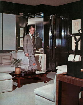 Baldwin was as timeless as was his interiors. Baldwin was as timeless as was his interiors. From his first book (and a second one I also dearly covet, Billy Baldwin Remembers,) I discovered how much he liked pure cotton and fake leather, but loathed faux fireplaces and fake books, believing that books were the greatest decorative element that any room could have. Built-in bookcases, Parson-style tables, comfy chairs and sofas and a certain basic practicality were essential Baldwin staples.
One favorite quote of mine seems to sum up a lot about this dean of design and his timeless approach. “Lately I have been thinking how comfort is perhaps the ultimate luxury.” I would add....comfort is also a necessity. --Michael A Thomas, FASID, CAPS 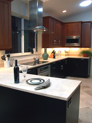 There are many choices for counters. There are many choices for counters. As designers, we help our clients make certain important decisions in the design of their home. And whether that be a kitchen or a bath, one of those decisions addresses countertops since they play a significant role in the design of those spaces. Many choices and options are available for counters and making such a decision is an important and key element and something not to be taken lightly. Certainly natural materials such as granite, stone, marble and slate are timeless choices. And man-made materials such as solid surface products that include quartz as a part of their content are wise and smart since they can provide a cleanable, virtually seamless installation. But there are several other materials worth consideration if only for accent materials. 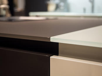 Glass counters can be polished or frosted, colored or not. Glass counters can be polished or frosted, colored or not. • GLASS The first is glass. A thick, translucent slab of glass is tough, sanitary and has a pleasant tactility, while still remaining easy to clean. Available in a huge variety of colors, finish and patterns, it certainly isn't the least expensive choice but can provide a certain "glitz" to a kitchen or a bath. It is important to use cutting boards so as not to scratch the glass but as important, keep knives razor sharp. 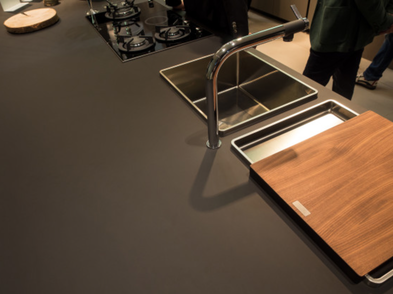 Just out, Nanotech will become a timeless classic. Just out, Nanotech will become a timeless classic. • NANOTECH The most unusual alternative countertop recently introduced at EuroCucina, the trade event for kitchen and bath cabinetry, came from Italian designer Arrital, courtesy of Arpa Industriale. Referred to as a “nanotech matte material,” the Fenix NTM countertop is anti-reflective, anti-fingerprint, self-healing, and soft to the touch without being... well, soft. It felt great under our hands, and looked great. 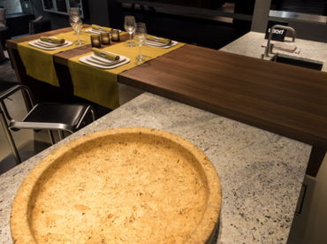 When combined with other materials, wood can be great. When combined with other materials, wood can be great. • WOOD Solid wood and wood-finished countertops have become most popular in recent years, often contrasting with or overlaid on a stone or synthetic material. Choices include everything from mahogany and ebony to light pine and even bamboo. Often paired with matching cabinetry to create a minimalist yet warm look, there is some minimal maintenance and care required to keep the counter looking fresh. 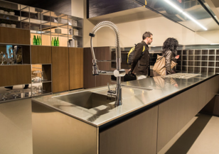 Consider stainless counters for accent spaces. Consider stainless counters for accent spaces. • STAINLESS For some of us designers, stainless is nearly as played out as granite. But when combined with other materials, it can be a real standout. Stainless counters gleam under light, are pretty indestructible and make a dramatic statement. One might consider using this material on an island or perhaps at a wine bar or accent counter. 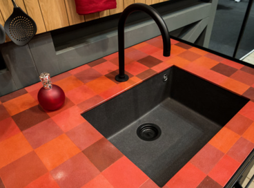 Porcelain or ceramic tiles are never out of style. Porcelain or ceramic tiles are never out of style. • TILE When it comes to countertop finishes, tile is pretty old school. It’s a style that’s generally beholden to a certain era or area—especially homes of the 40x and 50s. They stand up to a lot of wear - except for minor chipping that can occur with a lot of use. In bathrooms, tile can provide a texture and a pattern that can provide an added dimension. Plan on sealing the grout on a regular basis to keep a clean look and avoid a dingy appearance. 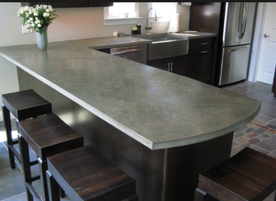 Concrete counters can be made off site or right in the space. Concrete counters can be made off site or right in the space. • CONCRETE More and more people are realizing concrete’s value for making countertops. Shapes of concrete countertops are only limited by imagination and the ability to build the forms. With the use of color pigments and in combination with various aggregates including glass and metals, the spectrum of colors and patterns available in concrete countertops is virtually limitless. One thing to keep in mind is that concrete counters must be occasionally sealed to prevent stains. Creating a concrete counter can be labor intensive so prices are often as much as natural stones like granite and marble. 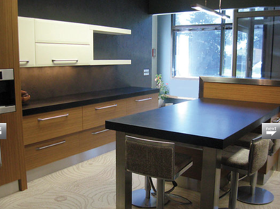 Paper tops have been around for more than fifty years. Paper tops have been around for more than fifty years. • PAPER Paper.. really? Bet you never ever thought paper would make a countertop but it can be quite effective. Products made from compressed, recycled paper provides a non-porous surface and a lifetime of stain resistance since it absorbs virtually no water. The paper "matt stone-like surface" is extremely rigid and dense, lending to additional applications beyond countertops and mars may be sanded or rubbed out with an abrasive pad. We used to see these as lab counters in college and they would stand up to all sorts of abuse. 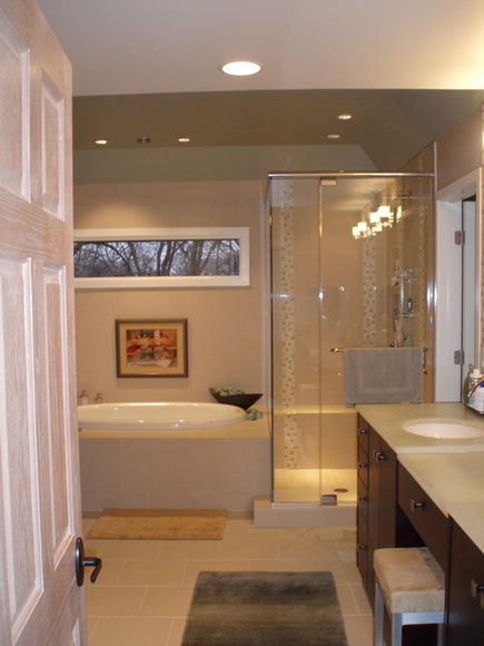 Still confused? Too many choices? Keep in mind that your choice should be just as much about the function as the visual effect. Price may influence your decision, but keep in mind that you are going to live with your choice over the years... perhaps even decades. And the price per square foot stretched out over a decade equalizes the choices we shared in this post.
And STILL CONFUSED? We can help. Call us for a complimentary consultation and we'll help provide some direction and advice. After nearly three decades of practice, we can give you the kind of well informed guidance to make your decision the most proper and appropriate one. • Voice: (760) 322-3784 • Email: CLICK HERE By Michael A. Thomas, FASID, CAPS Whether creating a residential or commercial environment, interior design always begins by establishing how a space is to function. Without defining how the interior is to work, no matter how great it looks, the space can fall short of expectations. And in those first critical steps, the designer applies their knowledge, education and experience to define how the interior is to function.
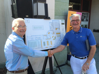 Thomas and Kleindienst, the Wellwood's Design Team. Thomas and Kleindienst, the Wellwood's Design Team. Having collected sufficient data, space planning was the next step. The new interior for the library is organized to accommodate practicality, traffic flow and storage. Fixtures, furnishings and equipment were blocked into a scaled drawing to show and demonstrate their relationship to architectural elements such as walls and columns, doors and windows. However in the case of the interior design for the Welwood, an additional set of criteria was necessary due to the historic nature of the Class One designation by the City of Palm Springs. 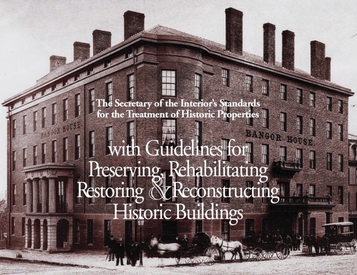 The Secretary Of The Interior's Guide for Historic Buildings The Secretary Of The Interior's Guide for Historic Buildings REHABILITATION : A PLAN TO ADAPT AND REPURPOSE FOR THE WELWOOD At the beginning of this design phase, it was important to refer to best practices established by national leading authorities for the design of such interiors. For this project, documents published by the National Park Service and the U.S. Department of the Interior and especially the Standards for Preservation and Guidelines for Historic Interiors were essential tools. These guidelines clearly identify four distinct paths that designers can take. • The first is Preservation and is defined as the process of applying measures necessary to retain the furnished interior's materials and character-defining features and use them as before. Since the library had been previously been cleared of nearly all the original furnishings and fixtures, preservation was not a consideration. • Another possible path is Restoration. That is defined as the process of depicting the form and function of a property at a particular period of time. Since the function of the space has changed dramatically from an interior once filled with books to a space that will serve as a visitor’s center hosted by the Palm Springs Board of Tourism, a secured environment for the Palm Springs Historical Society and a micro-branch of the Palm Springs Public Library providing concierge-style services, a path of restoration was not an option. • The third path is Reconstruction. This means depicting, by means of brand new construction, the form, function, features and detailing of a non-surviving site. Since the library exists, this was not an appropriate selection. • The final path, and the one chosen to guide the library’s design, was Rehabilitation. This is the process of creating a compatible use for a property through repair, alterations, and additions while preserving those portions or existing features which convey its historical, cultural, or architectural values. Based on the criteria provided by the staff of the Palm Springs Library, the Palm Springs Library Board Of Trustees and with the assistance of Mr. Kleindeinst, the vision for the interior became clear. 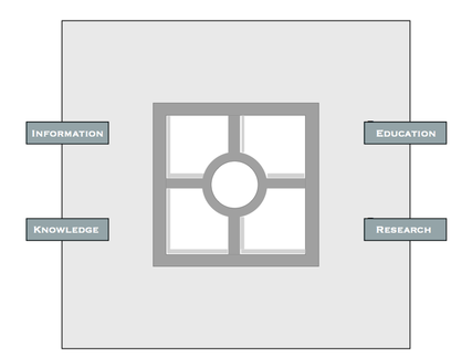 Once the space plan was complete and approved, the design of the furnishings was next. With the exception of the reception desk, furnishings, cabinetry and seating have been designed with clean, simple and straight lines to honor and compliment the work of the original architect, John Porter Clark. The reception desk will follow the shape and location of the original but will adapt for computers, printers, point-of-sales equipment and accessibility requirements required by the American Disabilities Act (ADA). SYMBOLISM PLAYS A ROLE To represent a new use of the space, an embellishment was created: a circle in a square. This design is adapted from an ancient tribal design and represents the information, education, research and knowledge to be delivered by the three stakeholders. This symbol will be used discreetly on furnishings and cabinets to reinforce the “brand” and communicate graphically the library’s new function.
 LIGHTING WILL BE BOTH SPECIAL AND SUSTAINABLE Of particular note is the energy efficient LED fixtures that will softly and quietly illuminate the space unlike the type of lighting seen in retail spaces. Hanging pendant lights were inspired by the existing coach fixtures that flank the main entry of the building. Classic, library-styled lamps with shades made from recycled newsprint and book ends will provide the needed task light for visitors to view their tablet computers, to check emails on their smart phones or to lounge in chairs and read the numerous newspapers and magazines the library will make available. The design solutions for the Welwood have been created to stand up to the acid test, a requirement for projects like the Welwood. While reminiscent of the past, the timeless design of the interior when opened late in 2014 will serve the needs of many types of guests, providing locals, tourists and historic researchers with a space that is comforting, inviting and memorable for now and for years to come. About: MICHAEL A. THOMAS, FASID, CAPS
Michael is a professional interior designer with three decades of residential, commercial and hospiltality practice. He is an award winning designer, including a Presidential Citation from Florida Southern College for his contributions to the preservation of the FSC's Frank Lloyd Wright West Campus. He is the past National President of the American Society of Interior Designers (ASID), and is one of only 250 "Fellows" of ASID, the highest honor ASID gives to a member. In addition Michael is the co-author of the well respected book, Residential Design For Aging In Place, a "certified aging in place specialist" and founding member and current President of DAASE (the Design Alliance for Accessible Sustainable Environments).  In the first of a multi-part series for Spaces + Places, a new design magazine, interior designer and author Michael A. Thomas suggests how to bring that "spa hotel' look right to the bedroom. For three years, I was traveling as a volunteer leader for my professional society, ASID, sometimes heading out every ten days or so to meet members, crisscrossing the country to host meetings and teachworkshops. And with all that traveling, a basic hotel room with a mini-frig, good Wi-Fi connection and a comfy bed often became a welcomed refuge for the night. During those travels, I began to notice a distinct change in the design of hotel rooms. Spaces once decorated with overtly busy floral quilted bedspreads, matching shams and blackout drapery were giving way to plain, simple and easy to maintain materials. Sometimes bed linens were just layers of perfectly ironed sheets and pillows of various shapes and sizes. This trend was a result of hotels switching to “spa-resorts” designed interiors complete with comforters, oversized towels, fluffy robes and toiletries with exotic names. In some higher end accommodations, basic black coffee makers were replaced with in-wall cappuccino machines, a great amenity for those who need their early morning shot of caffeine. I prefer my ice-cold diet Pepsi. So how do you create the “spa” feel in your own bedroom without spending a fortune? Here are ten basic tips gathered together after so many days on the road to help turn your bed space to a spa resort.  (1) Get rid of all the excess color and go for a splash of white. Lots of white. Bed sheets, shams, comforters and throws in a crisp white will do more to create a “luxe” hotel room than any one thing. And if you want a “pop” of color, use a set of accent pillows with interesting weaves or patterns,… just keep it simple. (2) Make the bed a “work of art.” Tuck and fold and tuck some more. Make sure the bed garments are neatly folded with no loose ends showing, right down to the edges of the pillowcases. And if you really want to make a statement, press and iron the top layer of the bedding. And use starch. I know it is a pain but it creates a rich, crisp look. (3) Lots of pillows on the bed are a nice look but what do you do with layers of pillows when you are ready for bed? Instead opt for sham-style pillows with lots of loft, two for a queen, and three for a king bed. And two sleeping pillows each with pillow protectors. Not only do protectors extend the life of a pillow, they give the pillows a smoother appearance. (4) Clear out excess clutter in the room. Minimize the accessories and art. Get rid of the stacks of year-old magazines or books you’ve been meaning to read or hide them away in a basket. And if the room needs a paint job, consider mid to deep toned neutrals with an ultra flat finish. White colors look even whiter against a background of nothing-neutrals.  (5) Give yourself a treat : purchase a new robe and towels. White or off-white of course. I prefer robes without too much bulk but they must have pockets. And I suggest oversized bath towels with plenty of size, texture and bulk. One client of mine will only have bath sheets (not bath towels) in her bath that have additional width and length. (6) Make an investment in a fine radio, one with a connection port to charge your smart phone and that can playback your favorite tunes you have downloaded on it. After a rough day, you’ll appreciate having your own music in the background to take your mind off the activity of the day. 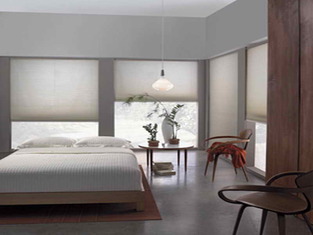 (7) Put all the lighting on dimmers. Whether table and floor lamps, overhead or accent lighting, the warmth and coziness of a space will be greatly enhanced by the softer lighting. And for those bedside lamps, put them on “touch-sensitive” switches… available for less than $12.00 at the big box stores. The make it so much easier to turn them on and off without reaching up under a lampshade to find the switch. (8) Think about the windows as you develop your plans for your own personal spa-type bedroom. For me, I like to look out to my private courtyard as much as possible so I have no window coverings other than roll down, damask-patterned sunscreens. But for some of my clients, they must have total or near darkness. Roller shades with black out shading behind or sliding panels of blackout materials work really well and reduce the need for yards of dust-collecting drapery fabric. 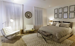 (9) There should be at least one chair in a bedroom area… and size matters here. Think about how you might use the seating. If a chair is only a space to “store” the extra bedding overnight, you probably have too much bedding. Consider one good stiff chair, ideally near the closet to put on shoes. Space permitting, and if you like to read someplace other than the bed, select a fully upholstered chair with a “pillow” back cushion, rather than a more ‘traditional style” back cushion. If the space is small, consider adding a bench near the bed or at the window.
(10) And finally, add a tray. A fine wooden, painted or woven rattan tray is an excellent place to store the purse, wallet, iPad or other daily essentials. Make it a habit to drop off these items in one location every day. It will save time the next day. You might add to the tray bottles of water, a scented candle or a bowl of your favorite potpourri. Mine is clove and cinnamon. Now you are ready. Sit down. Lay back. Enjoy your spa. - Michael Thomas, FASID is a well known designer, teacher and author with design offices and retail home decor studio in downtown Palm Springs, CA. |
 .................................................
• Michael A. Thomas, CAPS, FASID is a passionate interior designer that constantly examines the impact design has on the human experience. Michael is an award winning interior designer based in Palm Desert, CA. He is a Professional Member of the American Society of Interior Designers and a member of the ASID College of Fellows.
As a Certified Aging In Place Specialist, he creates smart looking spaces that are safe and secure and create homes for a lifetime. And with thirty plus years in the profession, he has honed his humor, elevated his passion for design and sharpened his wit to not take anything too seriously except his design work. 
Archives
February 2023
Categories
All
|
 RSS Feed