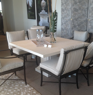
 One Of The Showrooms Which Featured Neutrals. One Of The Showrooms Which Featured Neutrals. Each year 75,000 people and 2,000 exhibitors meet in a little village called High Point, NC for the semi-annual furniture market, a trade and wholesale event for interior designers, along with furniture and retail stores. This year, there were so many warm and cool neutral colors in upholstery, lighting and accessories that one could draw a conclusion that neutrals are “back in style”. But for me, neutrals never left to begin with. They have always been “in vogue” in my book. The reason is that neutral colors are both classic and timeless. They can visually expand spaces, minimize problem architectural features and serve as background to an art or book collection. They are ideal for those individuals who are unsure about a color choice especially those color choices that typically tend to be more fashionable or time specific. Neutral palettes can be subtle and stylish, creating spaces that are quiet, restful and soothing. But they also can be big, bold, warm and energizing.
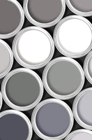
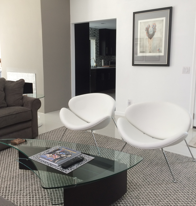
 Yet for all the reasons noted, some believe that neutrals are only whiney white, boring beige and stodgy gray. It does not have to be that way. With tones as varied as luscious latte, cinnamon biscuit and driftwood gray, neutrals are anything but boring. Tweaking colors is also an easy way to put pizazz in a neutral palette. Walls with just a slight bit of olive, a washed out plum or a wee touch of cocoa can make a very strong and dramatic background especially when combined with bright white for the trim, moldings and doors.  And finally, be aware there is a certain hidden power in a neutral color scheme. It allows you the freedom to layer in patterns in a room, freshen up a space with colorful accessories, change the art, create different focal points, and make seasonal changes almost on a whim. Such is the case with a recent project. The client had the perfect space to "shape shadow" the walls in her living room by adding grey charcoal tones to the fireplace and again at the entry. We hung some amazing art, added a wool rug woven in three neutral tones and placed the white leather nut-shell chairs on top. The result was crisp, clean and certainly not boring.
3 Comments
Beth And Andee
11/13/2014 01:15:03 am
Great advice Mr Thomas. Loved reading your suggestions. Do you have a favorite neutral color that you like to work with? I would love to know.
Reply
Stanley v.
11/24/2014 08:39:59 am
Love this blog. Neutrals give me so much flexibility. I like your approach.
Reply
Barb
11/30/2014 11:46:35 am
You are always so right on with your design. I love following your blog and what you design. Many thanks for sharing.
Reply
Leave a Reply. |
Michael is an award winning interior designer based in Palm Desert, CA. He is a Professional Member of the American Society of Interior Designers and a member of the ASID College of Fellows.
As a Certified Aging In Place Specialist, he creates smart looking spaces that are safe and secure and create homes for a lifetime. And with thirty plus years in the profession, he has honed his humor, elevated his passion for design and sharpened his wit to not take anything too seriously except his design work. Archives
February 2023
Categories
All
|


 RSS Feed