A Little Friendly Advice: Bigger Isn't Always Better In Kitchen Design: Just Make It Efficient.3/1/2017 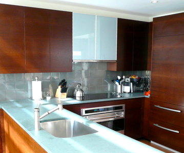 By Michael A. Thomas, FASID, CAPS When a potential client called to discuss how we design kitchens (and bathrooms, and provide the cabinets thru DuraSupreme) I was amazed by their desire for a new kitchen to be in their words "the size of a football field." Don't get me wrong. Large family style kitchens where everyone is around can be both a culinary and a social space. But setting aside acres of floorspace for a kitchen that may be frequently used to make "reservations" at a favorite bistro instead of making mom's baked apple pie would seem to be a waste of space and dollars too. The longer we spoke it became apparent that what they really wanted was an efficient kitchen space and they had determined that by making the kitchen larger, they would achieve their goal. As a designer of many such spaces and as the primary cook in my household, I am certainly qualified to give them advice about how best to make a kitchen that works efficiently as well as effectively. And while additional space is always a luxury, it does not necessarily make a kitchen work any better. So after being the chef of the house for some 30 years, here are three brief suggestions for designing a fabulous kitchen that works just as hard as the cook does. (1) Be Realistic. Pare down to the basics. The old saying "Keep It Simple" applies here. Do you really need a waffle iron, an electric skillet, a food processor and a George Forman's Burger Grill up on the counter at the same time? And what about those 7 packets of taco seasoning that somehow get pushed deep into the pantry closet? Establish your kitchen's "design core" around only the most frequently used appliances and food stuff. And if you are given the latest and greatest kitchen gadget but only use it on special occasions, find a location so they don't get in the way of what you need to use on a regular and daily basis. And get rid of all the outdated taco seasoning packets and use fresh salsa instead. Spices should NOT be purchased in bulk unless you are a restaurant because they loose their potency in as little as 30 days. (2) Think Zones: As you contemplate a new layout, think about the main activities that occur or what can be called “zones.” Cooking, • Baking and • Cleaning. (Some would also suggest "eating" should be considered as a kitchen activity but perhaps it should be someplace other than over the kitchen sink.) --COOKING: When it comes to cooking, arrange all the required tools around the cooktop. Pans, pots and utensils should be stored so that they can be pulled out easily during the cooking process. Organize all the drawer and door cabinets with as many dividers, rollouts and racks as possible. This helps keep the storage efficient and provides a somewhat defined location for each pot and pan, spatula and spoon after they are washed up. And besides, you will spend less time in the kitchen if you can find the items you need as quickly as you need them. --BAKING: The process of creating something hot from the oven is for many a lost art in the era of microwaves. Some would say they just don't have the time. But with even a small space devoted to baking with all the necessary tools and supplies at hand, one can quickly appreciate the fine art of baking. Think warm bread or cinnamon rolls fresh from the oven. YUM. Plan on devoting even a small amount of counterspace that can be used just for baking such as stirring together food and rolling out pie crusts. Another tip is to keep everything else cleared away from the landing pads nearest the oven so there is a space to sit a hot dish down when it has been in the oven at 375 degrees for one hour. Keep mixers, ladles, containers, cake and pie pans separate from all other items since you wouldn't necessarily use them in the cooking zone. 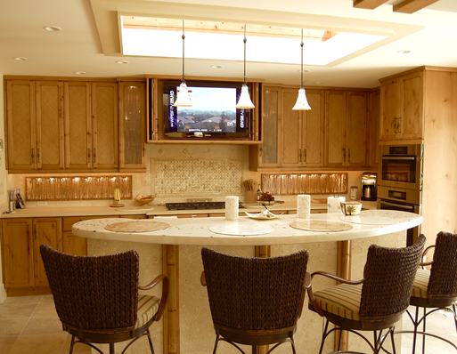 --CLEANING: Whether in a small or large kitchen, clean up should occur as an ongoing process. When finished with the vessels, pans and utensils, place them near or in the sink to free up other zones. I am a proponent of a large single compartment sink as it provides a singular space to accumulate all the things that will eventually be washed or placed in the dishwasher. And include a hefty, well built garbage disposer to that sink. Also I am not fond of those very tiny veggie sinks. But if you do, add a garbage disposer to it as well to add to the functionality. You might choose drawer style dishwashers that provide certain benefits like quick loading times, shorter wash cycles plus generally use less water and energy.  (3) Go Tech.
These days technology has changed the way we do many of the routine tasks. As an example, cookbooks that can clutter counters and shelves can be replaced by an access to the Internet. Set aside a small clean, clear space for the laptop, tablet or even cell phone to browse and discover the best apple pie recipes. And all those favorite recipes that have been collected over time can be scanned, saved to a computer and referred to in a matter of minutes. In my household, a fully wireless tiny flat panel TV sits on one counter and provides access to the news, checking my emails and the latest recipes on the Net. Because it connects without a wire (other than the electrical cord when charging the battery) it can easily move out of the way when I need the space. So there you have it. Three quick concepts for making a kitchen a place to come back to, not just for making reservations, but a truly home cooked meal with all the trimmings.
11 Comments
 "Good clients are knowledgable.
Great clients are well informed." Those are the words I gave to a potential client, one who had never used the services of a professional interior designer and was in the midst of interviewing several other designers for their job. So after the first meeting, I felt the need to provide them with some advice about their upcoming project. • Be practical in all your choices including what and how you spend the dollars. Great design does not equate with spending large sums of dollars although that is often the perception of my profession. My advice to each new client when deciding what to spend : Put greater dollars toward just a few things that are most important to the design, that make the strong visual statement and that make the space function as needed. Far less dollars can then be spent for the rest as fill in pieces. Just don't skimp on something that will forever show you did. And at the end of the day, if you follow that advice, you'll discover that the entire space will look like a million but cost far less. • You need to have a definite plan before you start any work. Our first meeting was about seeing your new space. And shooting from the hip is great to build a bunch of fresh ideas about what you may want from the project but at the end of the day, the work you are contemplating will be an investment of time and effort. So my advice: plotting and planning on paper reduces the chance for mistakes in time, in expectations and in dollars spent. Steve Chase, the internationally known Palm Springs designer said about his work, "I am more deliberate than spontaneous in my design." I totally agree. Making a plan is worth every cent you spend. • Your designer needs to be your partner. Another bit of advice: You are making a huge change in locations and environments. That alone is a lot of stress. The design professional you engage should make the process thoughtful, provide the needed counsel on critical decisions and has your best interest on the table. With the right design partner, you'll discover a sense of comfort in making the seemingly numerous decisions that lie ahead and that alone reduces anxiety. The best ROI will not be in how much money you spend for furnishings but in the designer you hire. • And make this home fun. A final bit of advice: This home should reflect the energy of the occupants and its guests. So have some fun with making this house a home. Encourage your designer to implement something unexpected, something that keeps the space lighthearted and brings a smile to every face that encounters the design. And finally don't forget to make this journey fun. Interior design can be overly serious from time to time. After all when 80% of our time on this planet is spend indoors, design impacts everyone who lives and work in the interiors and there is a need to make it right. But take time to stop and reflect on the journey,... the opportunity to plan something special for you, your family and this house. You Can't Judge A Book By Its Cover But You Can Dress It Up And Make It Look Better With A Little Work. 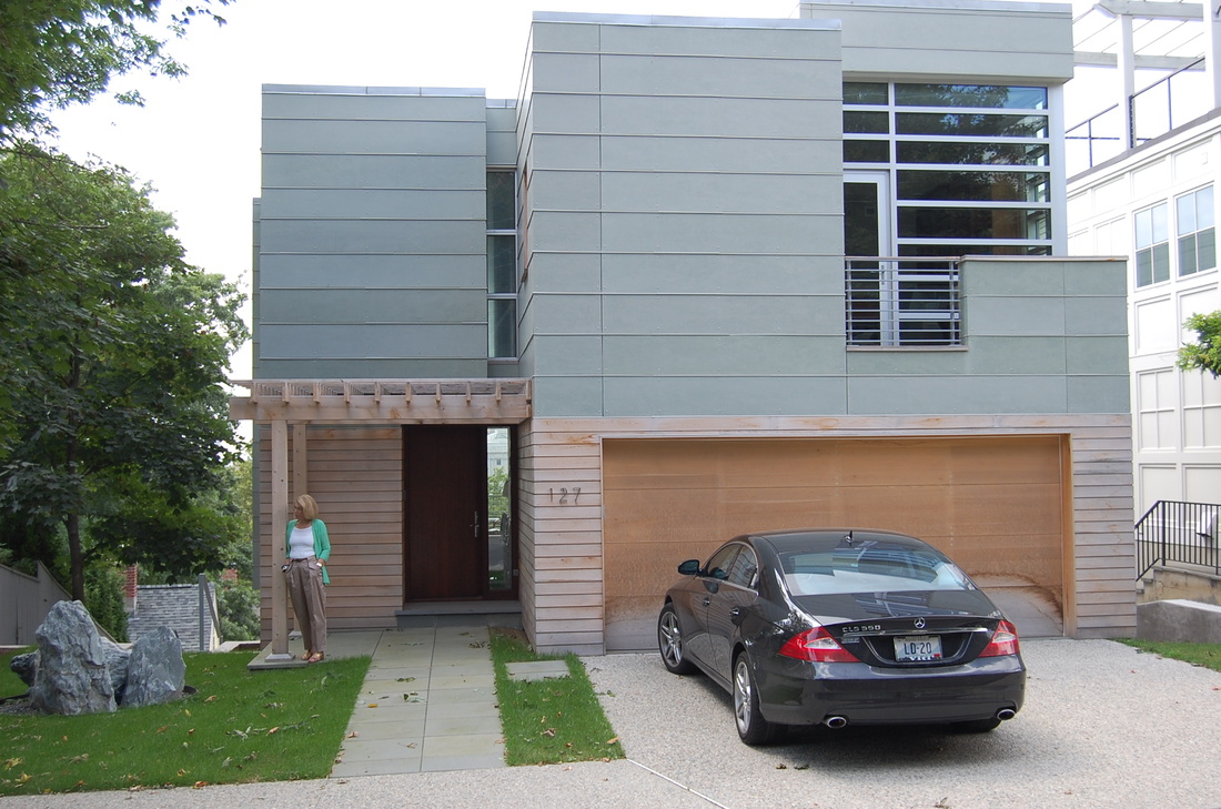 In 1946 the phrase "You Can't Judge A Book By Its Cover" first appeared in the murder mystery novel Murder in the Glass Room (by Edwin Rolfe and Lester Fuller). It is also a well known English idiom which means "you shouldn't prejudge the work of value of something by how it looks." But since you only get one opportunity for a first impression, if you are planning to place your real estate on the market, it is wise to make a strong first impression.
So here are three quick, easy and uncomplicated ideas about how to make the most of that first impression starting right at the curb. (1) The front facing side of a home is one of easiest, quickest ways to communicate the right impression. While the exterior of your home may be painted in a quiet, perhaps conservative color or stuccoed with some boring beige material, the main door or the garage is a place to have a little more fun by adding a contrasting color, perhaps even a bright pop of color that will lift your home’s main color and increase that curb appeal. And if you don't like it... it's something fairly easy to change. So just get to the paint store and pick out a few colors. Many paint departments will have very small vials that you can buy for less the $5.00. BUT if you are still unsure...don't put the color just yet. Paint a good size piece of cardboard, place it up against the door and then get to the curb and look back. Does it pop? Does it communicate who you are and what you like? (2) Add some planters, flower boxes, hanging baskets or just re-do your main garden around the front of the place using one or two overscaled plantings to create a feature. Adding such items is like adding accessories. Choose items that require little or no maintenance and will stand up to the elements if you don't have that green thumb. And...Try for one theme or color. For instance, in the desert, look to the color of cactus as a theme. Then use that same green in pottery or planters to provide continuity. Shutters painted a deep Saguaro color will always be a classic color that few would grow tried of. Perhaps add dark green recycled glass as mulch, something then that you will not have to replace anytime soon. And by the way... a deeper green is a color that has greater appeal to those with higher incomes. Think of green marble for instance,... in a bank or law office. That same green marble would be silly looking in a Target. Besides... it might clash with that Red Target bullseye logo. (3) Finally, look at your exterior lighting. I have found the scale of many exterior light fixtures to be just wrong. Recently in a walk by a contemporary home near where I live, there were these great stone faced columns at the fornt of the house.... about 24" square and 5 feet tall. On top was this silly looking colonial light fixture that was no bigger than a child's shoe box. And at night, it was illuminated with only a 40 watt light bulb. What a waste of design, money and energy. Changing to something appropriate to the size and scale of the columns would have meant just going to a local lighting store, even a Home Depot and buying one to try out before calling the electrician. So keep in mind that lighting style, output and size are the important criteria for choosing the right fixture and increasing curb appeal.
The workshop will feature case studies of clients and showcase their homes that incorporate “universal design” solutions with high style aging-in-place features. And in case you have not met our founder and designer, Michael is a Fellow ( one of only 200 in the country) and Professional Member of ASID, the American Society Of Interior Designers. He is also he co-author of the professional book “Residential Design For Aging In Place.” He has been quoted and had projects published in various media including Dwell, Interiors + Sources, Time Magazine, the Miami Herald, Florida Home & Garden and a video segment on the Travel Channel.
“With 76 million baby boomers contemplating their future, now is the time to consider how and where they will live in safe, secure but also beautiful sustainable home environments,” he stated. “But it is important to know that aging-in-place designs are great for everyone, no matter the age or ability.” There is no cost to attend but reservations are required and seating is limited. The event will be held at Design Pure + Simple, 301 N. Palm Canyon Drive, Showroom #103, Palm Springs, CA 92262. And for those interested in Michael's book, a book signing will follow the event. To make a reservation or for further information on this or other events this summer... contact Design Pure + Simple at 760 - 322 - 3784, Ext 1 followed by the # key. Also check out: http://www.shopdesignpureandsimple.com/summer-design-lectures.html  Design is not about trends. It is about defining a design process to get to successful conclusions. With more than three decades of practice, I have come to a couple of conclusions about life in the desert valley. But it doesn't matter where one is in the world, the design and the design process impacts the human experience on many levels.
So here's what I've been thinking about that. Everyone in the design profession looks at design trends and interior designers. Clients are no different. But if there is one trend that is classic and enduring it that good design process is good design. No matter how you might slice it, design that functions as intended, that complements the client and provides them a higher quality of life will always been "in vogue." And if it increased the value of the real estate in some way, even better. It's not the colour du jour nor what the furniture designers create that makes the difference when it comes to trends. It's about sitting down with a client, nose to nose, getting them to share their desires, goals and objectives... no matter whether the style is contemporary or classic. But how do you start such endeavors? It starts with a through conversation about what clients hope and desire in the design of their spaces. And as an experience designer, I can dig that information out and offer it back as credible design solutions. So my first question asked during an initial client interview is this: "How Did You Come To Realize That You Might Need The Services Of An Interior Designer?" With that open ended question and with many to follow, I can begin to visualize what I will need to do to match the client's expectations. And being in alignment with the client makes all the difference in a successful client relationship. During the course of that first meeting, it will be important to understand who all will be involved, what special needs that require attention and what the time frame is. Designers also like to know if there are any requirements such as working with a preferred set of trades, incorporating any existing furnishings inventory and who will make all the final decisions. That's the design process that every client should expect no matter the designer, architect, builder and contractor. It helps to define the scope of work so that there are no misunderstandings about who will be responsible and for what. That's the design trend, trust and transparency that will further define the outcomes, something that should be the goal when a client interviews the designer and when the designer interviews the client.  Eileen Gray, avant-garde artist, designer and architect, was one of the leading members of the Modern Design movement. While not as well known, she was a progressive pioneer in the execution of multi-purpose, built-in furniture and use of plywood, tubular steel, cork, plastic and other industrial materials. Born in Ireland in 1878, the youngest child of a wealthy Anglo-Irish family, her father encouraged her in the study of the arts. She attended the Slade School of Fine Art in 1898 and traveled to Paris with her mother to attend the Exposition Universelle. It was a “world’s fair” of sorts and it provided her much inspiration. What is often unknown about Gray is that she studied for years in Paris with the Japanese lacquer artist Seizo Sugawara. There she mastered the art of lacquer and pushed the envelope of this craft adding gold, using silver and experimenting with texture in the finishes of cabinetry, moldings and screens, earning her a well respected name for her works.  The E-1027 Villa, the vacation retreat of Gray She spent a career designing in much the same way as Frank Lloyd Wright ~ designing every element of the spaces. Glass partitions, zinc-covered cabinets, corrugated sheet metal, transparent celluloid fabric used as mosquito netting. Gray used all those materials which resulted in a refined environment of comfort, utility and above all, beauty. But it would be her design of one table that most know her by. This multipurpose piece is officially known as E-1027 Table, a piece she designed for her vacation house in southern France. 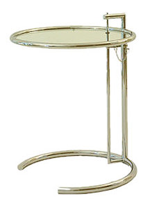 The Classic E-1027 Adjustable Table. The cliff-side retreat was an L-shaped building with a flat-roof, floor to ceiling windows and a spiral stairway to the guest room. It was both open and compact. And the E-1027 tables moved about the house as needed, changing heights easily, sliding under furniture to save space.
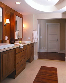
Today, from classic traditional to modern contemporary interiors, the classic form and shape of these tables are used in every room and for a variety of purposes. Bunched together and adjusted to different heights, they make great bunch tables. We carry a very fine reproduction of the E-1027 table. For us, it makes a great side table near one's favorite chair as a place for a drink, the remote control and the daily reading. But we've seen them used as night tables in a master bedroom.  Several months back, a client in Rhode Island asked if he really needed a grab bar in the bathroom. He hated the way they looked and he thought that they would not match his new polished chrome plumbing fixtures with the overhead rain shower. So I asked him how important safety was in the home. He said that he intended to have a state-of-the-art, built-in security system installed as the home was being built. So I began to explain that safety and security goes well beyond an alarm system and that certain features like a curb-less shower and a level threshold at the main entry might help prevent accidents but just as important, would provide the opportunity to return home early from a hospital stay if something were to happen such as breaking a leg or hip.
He said, "Yes, I can see that might be but it's just the thought of other people seeing a bar in my bathroom and thinking that I am disabled." So I replied easily, "This is really about providing you with a measure of personal independence and not about what others may think about you." Then I reassured him that these concepts about aging in place are not a trend not a fad....and would raise the value and quality of life as we mature. By adding certain features in the design of our homes provides us with the opportunity to maintain our personal independence.... something that none of us would want to give up at any age or ability. So I offered him creative design solutions including a great looking "grab bar" in a snazzy polished chrome finish that would provide the aesthetics he was really asking for but also he knew that in his heart, at 86 years young, he would be able to hang on to something in difficult times. And that something was his independence. He passed away not too long ago but not after being in a place of his choosing for as long as he was able. We worked so well together in the design of his home and was excited to be able to move into it. He used that shower without a curb and even told me how great it was not to have to lift and step over that barrier. He told me he grabbed onto that grab bar every day because it made sense to hang onto something standing on a wet shower floor. And the last time we talked, he told me to make sure to tell others and have them see the value of having a home that supports one's independence. And with this blog post, I have done what he told me to do. Tell others. 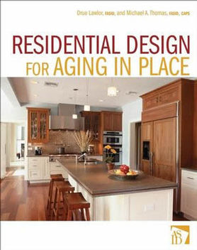 Never would I have thought in my career that I would get a call from a major publishing house like John Wiley whose interior design editor at the time John Czarnecki asked about whether there was any interest in writing a book about the upcoming trend of creating homes that support one's independence. It was surely a surprise and a welcome opportunity to work with a colleague of mind, Drue Lawlor, FASID to help communicate this important concept to interior designers, architects and home builders. But how do you write a book when you never have contemplated doing any thing of the like. John quickly replied that he and his editorial staff would guide Drue and myself thru the process from word creation to book cover. And so we did. Since that time, Drue and I have been seeing the book pop up in many places including Amazon.com, Barnes + Noble and book sellers from Seattle to Miami, Chicago to Houston. And when we do see it,... we grin... Because we know the message is gaining ground that you can design homes with a certain level of accessibility AND make it look great. And isn't that the best alternative when one considers that being in a home of ones choosing is the "ideal independence?" We think it is and we think that is how it should be no matter the age, no matter the ability. And with so many baby boomers reaching that time in their life where certain decisions are being made, they are discovering that aging in place is not a trend for the moment but a lifestyle that supports safety, security and independence. In a recent post on a blog, the book received many nice compliments. Check it out: CLICK HERE. This is your new blog post. Click here and start typing, or drag in elements from the top bar.
Decorati.com, a website that features what's new and fresh, classic and contemporary for interior design showcases an updated profile on Michael A. Thomas, FASID along with photos of his recent work.
To Read His Profile... CLICK HERE. 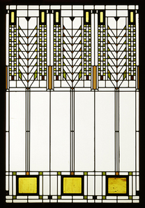 Design trends come and go and many are interesting to read about. But so much about “design trends” is centered around manufacturers who are introducing new product designs for work and home environemnts. Trends in design for those of us in the interiors profession often find bits of inspiration come from industries such as fashion, the design of vacation retreats such as hotels and spas, even emerging technology - especially with flat panel TVs hanging on every wall in the house. Certainly the trend of “green design” has made an impact with new trendy products being introduced all the time that either reduce the carbon footprint or are made from recycled materials, materials such as plastics, paper and fibers.
But trends do come and do go. So the question is: “How can an interior be created that avoids the trends and yet stays current over a time period?” There are three easy components. –> Keep it simple. –> Keep it functional. –> Keep it authentic. Design trends of the last five years have showcased interiors that are overdone, overbuilt and feature faux-this and faux-that. But after three decades in the profession to call upon, I can tell you that the best interiors are those that are understated, created carefully over time, assembled with materials that are true to both their function and aesthetic appeal. In addition, design needs to combine and complement all the elements of the built environment. Frank Lloyd Wright never created a project without considering the design and functional aspects of the structure, the interior and the exterior. Perhaps that is why it is always fascinating to see projects 60 and 80 years old that still seem au courant by today’s standards. He never followed a trend-du jour. He kept to a model that integrated both form and function into a single design statement. Our design trends for this year are simple: Get back to basics of design. Choose natural fibers for fabric, wall, window and floor coverings like wool, cotton and linen that are not only practical but are ‘green’ by their very nature. Spend the time to define all the design criteria up front. Make a list of the things that are required of the spaces like storage and what activities are planned for the various rooms. Re-use and adapt pieces in new ways. Edit down the number of accessories to only those that have special meaning or have some special value and donate all the rest. And finally, stop with the faux-painting and the faux-finishing. Don’t try to make something look like something that its not. |
 .................................................
• Michael A. Thomas, CAPS, FASID is a passionate interior designer that constantly examines the impact design has on the human experience. Michael is an award winning interior designer based in Palm Desert, CA. He is a Professional Member of the American Society of Interior Designers and a member of the ASID College of Fellows.
As a Certified Aging In Place Specialist, he creates smart looking spaces that are safe and secure and create homes for a lifetime. And with thirty plus years in the profession, he has honed his humor, elevated his passion for design and sharpened his wit to not take anything too seriously except his design work. 
Archives
February 2023
Categories
All
|
 RSS Feed