|
You Can't Judge A Book By Its Cover But You Can Dress It Up And Make It Look Better With A Little Work. 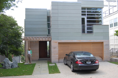 In 1946 the phrase "You Can't Judge A Book By Its Cover" first appeared in the murder mystery novel Murder in the Glass Room (by Edwin Rolfe and Lester Fuller). It is also a well known English idiom which means "you shouldn't prejudge the work of value of something by how it looks." But since you only get one opportunity for a first impression, if you are planning to place your real estate on the market, it is wise to make a strong first impression. So here are three quick, easy and uncomplicated ideas about how to make the most of that first impression starting right at the curb. (1) The front facing side of a home is one of easiest, quickest ways to communicate the right impression. While the exterior of your home may be painted in a quiet, perhaps conservative color or stuccoed with some boring beige material, the main door or the garage is a place to have a little more fun by adding a contrasting color, perhaps even a bright pop of color that will lift your home’s main color and increase that curb appeal. And if you don't like it... it's something fairly easy to change. So just get to the paint store and pick out a few colors. Many paint departments will have very small vials that you can buy for less the $5.00. BUT if you are still unsure...don't put the color just yet. Paint a good size piece of cardboard, place it up against the door and then get to the curb and look back. Does it pop? Does it communicate who you are and what you like? (2) Add some planters, flower boxes, hanging baskets or just re-do your main garden around the front of the place using one or two overscaled plantings to create a feature. Adding such items is like adding accessories. Choose items that require little or no maintenance and will stand up to the elements if you don't have that green thumb. And...Try for one theme or color. For instance, in the desert, look to the color of cactus as a theme. Then use that same green in pottery or planters to provide continuity. Shutters painted a deep Saguaro color will always be a classic color that few would grow tried of. Perhaps add dark green recycled glass as mulch, something then that you will not have to replace anytime soon. And by the way... a deeper green is a color that has greater appeal to those with higher incomes. Think of green marble for instance,... in a bank or law office. That same green marble would be silly looking in a Target. Besides... it might clash with that Red Target bullseye logo. (3) Finally, look at your exterior lighting. I have found the scale of many exterior light fixtures to be just wrong. Recently in a walk by a contemporary home near where I live, there were these great stone faced columns at the fornt of the house.... about 24" square and 5 feet tall. On top was this silly looking colonial light fixture that was no bigger than a child's shoe box. And at night, it was illuminated with only a 40 watt light bulb. What a waste of design, money and energy. Changing to something appropriate to the size and scale of the columns would have meant just going to a local lighting store, even a Home Depot and buying one to try out before calling the electrician. So keep in mind that lighting style, output and size are the important criteria for choosing the right fixture and increasing curb appeal.
1 Comment
 Eileen Gray, avant-garde artist, designer and architect, was one of the leading members of the Modern Design movement. While not as well known, she was a progressive pioneer in the execution of multi-purpose, built-in furniture and use of plywood, tubular steel, cork, plastic and other industrial materials. Born in Ireland in 1878, the youngest child of a wealthy Anglo-Irish family, her father encouraged her in the study of the arts. She attended the Slade School of Fine Art in 1898 and traveled to Paris with her mother to attend the Exposition Universelle. It was a “world’s fair” of sorts and it provided her much inspiration. What is often unknown about Gray is that she studied for years in Paris with the Japanese lacquer artist Seizo Sugawara. There she mastered the art of lacquer and pushed the envelope of this craft adding gold, using silver and experimenting with texture in the finishes of cabinetry, moldings and screens, earning her a well respected name for her works. 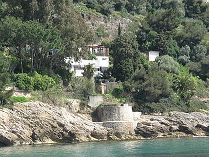 The E-1027 Villa, the vacation retreat of Gray She spent a career designing in much the same way as Frank Lloyd Wright ~ designing every element of the spaces. Glass partitions, zinc-covered cabinets, corrugated sheet metal, transparent celluloid fabric used as mosquito netting. Gray used all those materials which resulted in a refined environment of comfort, utility and above all, beauty. But it would be her design of one table that most know her by. This multipurpose piece is officially known as E-1027 Table, a piece she designed for her vacation house in southern France. 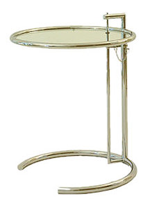 The Classic E-1027 Adjustable Table. The cliff-side retreat was an L-shaped building with a flat-roof, floor to ceiling windows and a spiral stairway to the guest room. It was both open and compact. And the E-1027 tables moved about the house as needed, changing heights easily, sliding under furniture to save space. Today, from classic traditional to modern contemporary interiors, the classic form and shape of these tables are used in every room and for a variety of purposes. Bunched together and adjusted to different heights, they make great bunch tables. We carry a very fine reproduction of the E-1027 table. For us, it makes a great side table near one's favorite chair as a place for a drink, the remote control and the daily reading. But we've seen them used as night tables in a master bedroom. 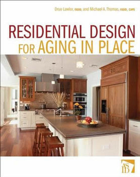 Never would I have thought in my career that I would get a call from a major publishing house like John Wiley whose interior design editor at the time John Czarnecki asked about whether there was any interest in writing a book about the upcoming trend of creating homes that support one's independence. It was surely a surprise and a welcome opportunity to work with a colleague of mind, Drue Lawlor, FASID to help communicate this important concept to interior designers, architects and home builders. But how do you write a book when you never have contemplated doing any thing of the like. John quickly replied that he and his editorial staff would guide Drue and myself thru the process from word creation to book cover. And so we did. Since that time, Drue and I have been seeing the book pop up in many places including Amazon.com, Barnes + Noble and book sellers from Seattle to Miami, Chicago to Houston. And when we do see it,... we grin... Because we know the message is gaining ground that you can design homes with a certain level of accessibility AND make it look great. And isn't that the best alternative when one considers that being in a home of ones choosing is the "ideal independence?" We think it is and we think that is how it should be no matter the age, no matter the ability. And with so many baby boomers reaching that time in their life where certain decisions are being made, they are discovering that aging in place is not a trend for the moment but a lifestyle that supports safety, security and independence. In a recent post on a blog, the book received many nice compliments. Check it out: CLICK HERE. This is your new blog post. Click here and start typing, or drag in elements from the top bar.
Decorati.com, a website that features what's new and fresh, classic and contemporary for interior design showcases an updated profile on Michael A. Thomas, FASID along with photos of his recent work.
To Read His Profile... CLICK HERE.  I read a press release that came from Ford Motor Company about research the company completed that clearly indicated the need to change the size of the fonts on the dashboard. And it needs to happen sooner than later as a result of baby boomer's failing eyesight. What a concept. Imagine actually being able to know how much gas is in the tank of the car or what radio station you are tuned into. And just think... what other products should be adapted to products we use everyday that would make it easier not only for Boomers to use, but easier at any age or ability. Ahh... What Is This World Coming To ....where great design impacts the human experience. What a concept! Baby boomers have a lot to look forward to if Ford's implementation of their research proves successful. Could this just be the beginning? Can you imagine the possibilities to have a GPS display projected on the windshield of the car, small enough not to get in the way of driving but large enough to glance over and make sure one is not only on the right road... but actually ON THE ROAD. Read more about this subject at my other BLOG: Just CLICK HERE to go THERE. I am going on Two Years in the desert. The heat is just not that bad compared to Florida.  I lived in Florida for the last two plus decades and I can tell you with authority that humidity - or the lack there of - makes all the difference in the world in turns of comfort. Today was 117 in the Phoenix desert valley and when the humidity is @ but 5%, you know that it's something that you can learn to tolerate. . . . better than being in Florida. I used to tell my snowbird clients that you get used to the humidity in FL during the summer months...especially after you live there for 20 years. But the real truth is that you can learn to live without humidity a whole lot easier even if the temps are @ 115 or above. BTW: You still do a lot of the same things...whether in FL or AZ... you go from air conditioning @ home to car to office to retail spaces to office to home to client's residence.... whether you are in FL or in AZ. And while you might traverse the distance with speed, at the end of the day, it seems it is still HOT in FL or in AZ. But one thing that is apparent.... without the humidity, it makes things a wee bit more tolerable. While I do miss the ocean... and I don't miss it that much... I don't certainly miss the Florida humidity at all. 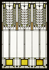 Design trends come and go and many are interesting to read about. But so much about “design trends” is centered around manufacturers who are introducing new product designs for work and home environemnts. Trends in design for those of us in the interiors profession often find bits of inspiration come from industries such as fashion, the design of vacation retreats such as hotels and spas, even emerging technology - especially with flat panel TVs hanging on every wall in the house. Certainly the trend of “green design” has made an impact with new trendy products being introduced all the time that either reduce the carbon footprint or are made from recycled materials, materials such as plastics, paper and fibers. But trends do come and do go. So the question is: “How can an interior be created that avoids the trends and yet stays current over a time period?” There are three easy components. –> Keep it simple. –> Keep it functional. –> Keep it authentic. Design trends of the last five years have showcased interiors that are overdone, overbuilt and feature faux-this and faux-that. But after three decades in the profession to call upon, I can tell you that the best interiors are those that are understated, created carefully over time, assembled with materials that are true to both their function and aesthetic appeal. In addition, design needs to combine and complement all the elements of the built environment. Frank Lloyd Wright never created a project without considering the design and functional aspects of the structure, the interior and the exterior. Perhaps that is why it is always fascinating to see projects 60 and 80 years old that still seem au courant by today’s standards. He never followed a trend-du jour. He kept to a model that integrated both form and function into a single design statement. Our design trends for this year are simple: Get back to basics of design. Choose natural fibers for fabric, wall, window and floor coverings like wool, cotton and linen that are not only practical but are ‘green’ by their very nature. Spend the time to define all the design criteria up front. Make a list of the things that are required of the spaces like storage and what activities are planned for the various rooms. Re-use and adapt pieces in new ways. Edit down the number of accessories to only those that have special meaning or have some special value and donate all the rest. And finally, stop with the faux-painting and the faux-finishing. Don’t try to make something look like something that its not. |
Michael is an award winning interior designer based in Palm Desert, CA. He is a Professional Member of the American Society of Interior Designers and a member of the ASID College of Fellows.
As a Certified Aging In Place Specialist, he creates smart looking spaces that are safe and secure and create homes for a lifetime. And with thirty plus years in the profession, he has honed his humor, elevated his passion for design and sharpened his wit to not take anything too seriously except his design work. Archives
February 2023
Categories
All
|


 RSS Feed